Assistance with Button State Styling in Plasmic

Hello Plasmic Team,

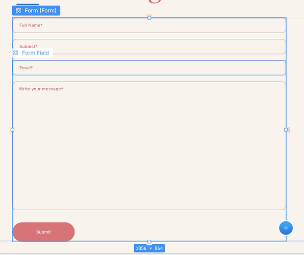
I have a button within a form that I’ve implemented, as shown here:

I would like to change the button’s style when it’s in a hovered state. Currently, it turns blue, but I’d prefer to apply my own custom styles. I’m aware that element states can be used to customize styles based on their state.

However, I don’t see any options for hover, focus-visible, or similar states in the interface. Could you please guide me on how to implement this?

Thank you for your help!

The specific component is here:
https://studio.plasmic.app/projects/cMv7LvHHC6kpLZxPuP6Vfa/-/Homepage?arena_type=page&arena=ftPR4D9vGnUC

What you need is to create variants! :blush:

I think Mr Biscuit’s tutorial might be helpful. Have you seen this: https://youtu.be/zqcTWz5u-wE?si=DxqV2taifh-fCidX?

1 Like

Thank you @aihe_team ! Sorry for the late reply.
I went into the original component and created variants, and this worked! Took a look at Mr. Biscuit’s tutorial as well. Thank you again!

2 Likes