Can anyone clarify what is meant by ‘Don’t create a breakpoint for your largest screen size’ language under the breakpoints menu? As it is, I’m using vw for my font sizes in order to scale fluidly, however, when I get up to 1920, etc. those fonts are huge.
A few questions: Should I change the size of the ‘base’ breakpoint to 1920, as it seems is recommended… or do they mean to just design in the 1440px size that the base is at and make it work on larger screens? Or, do you understand more to mean that we should change the base to the largest screen size we want to work with?
Trouble is, it still leaves me with potential issues on super large screens above 1920, which brings me to a couple more questions… Is there an option to define max font sizes? Or a way to incorporate a font size ‘clamp’ without any complex coding?
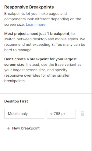
“Don’t create a breakpoint for your largest screen size” is because the base variant would represent the design for the largest screen size (indicators in blue). Other screen variants would represent the design for smaller screen sizes (indicators in red). I recommend reading Responsive design with screen variants | Learn Plasmic to learn more.
You can set the default font sizes for each screen variant by modifying your project’s theme. On the left panel, look for “Default styles theme”.
Thanks Jason, but I’m afraid your answer is far too generic and assumes that I know nothing about responsive design – whereas, I am pointing out some glaring limitations and hoping for some answers/best practices on how to use them. Specifically, you haven’t answered:
Should I modify the size of the base screen size to reflect the largest screen size I want to target? i.e. 1920, or is it recommended not to alter the base screen size?
Does plasmic allow for any kind of ‘max font size’ solution? As I mentioned, I am using VW for font sizes to scale fluidly, but there is always a need to cap that scaling (sometimes using clamp, or possibly using more screen size breakpoints, but ideally not having to do that). Just trying to understand if there is a method to handle this without any code.
If there is no way to better control the max font sizes, and I have to do it by implementing clamp via CSS, where would I inject that?
Hey @mason_richards, apologies, I certainly didn’t think you knew nothing about responsive design–quite the contract actually! I was just hoping to give you Plasmic-specific solutions about responsive design.
To answer your questions:
There is no “base screen size” in the responsive breakpoints panel, but you can change the screen size of the preview of the base variant in the canvas.
Plasmic doesn’t currently have any clamping features built-in.
If you have an app host, you can inject the CSS by importing the CSS file wherever you are loading the PlasmicRootProvider. If you don’t have an app host, you can insert a “Custom global CSS” component to the page (click the big blue plus button). Then you can add arbitrary CSS to your page.
OK, perfect, thanks Jason - this does help and I appreciate the response. What I mean by ‘base screen size,’ to be clear, is the 1440px that Plasmic refers to as it’s base screen size – so, trying to determine whether I should change that one to be the biggest screen size I’m targeting (such as 1920)? Normally, I would just create a new breakpoint at the largest size, but this brings us back to the initial question of Plasmic saying NOT to create a breakpoint for the largest screen size.
If your breakpoints are set to “Desktop first”, then you should add the following breakpoints:
Tablet: <= 1000
Mobile: <= 500
If your breakpoints are set to “Mobile first”, then you should add the following breakpoints:
Tablet: >=501
Desktop: >=1001
Notice how the largest/smallest screen size is the base variant (and therefore not added as a breakpoint), depending on whether you choose desktop/mobile first.