Hey Plasmic team! We are experiencing some bugs with the new responsive columns component:
- the gaps prop doesn’t support spacing tokens, when converting flex containers with a gap set to a spacing token, the created responsive column displays
—var(...) as the spacing value
- Why can’t we control the “columns / row” property based on variants (such as screen variants)? This would allow for much more flexible and less confusing dev experience. Right now we don’t really understand, how it decides when to show this property.
Thanks in advance!
Hey @balanced_crawdad!
1: I’m submitting this bug to the team, sorry about that!
2: the columns / row property appears when the Wrap property is checked, and you should be able to change it based on variants. If it is not working for your project, please send me the link so I can see what I can do to help you.
Thanks for your report 
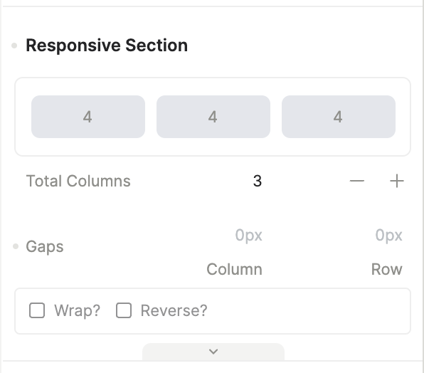
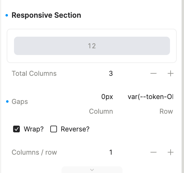
Yeah wrap is activated in the smallest screen variant (second screenshot) , but any other screen variant doesn’t have “wrap” activated and I can’t change that setting as it’s disabled (first screenshot). Hovering over “wrap” just shows me the “not-allowed” cursor.
Can you select the wrap property if you target the desired screen variant?
Yes I can indeed… Sorry for that. 
We do have another issue with a regular horizontal stack. When using wrap, other positioning props don’t seem to work anymore.
Hmm. Could you please show me the tree? I was trying to replicate it here but I couldnt do it
Just a quick update, the spacing tokens should be working as intended on the Responsive Columns gaps now
Here you go. Thanks for looking into this!
Hey, we managed to find the issue! 
The component PersonProfile that you are using has a mixin called container-full-width which causes it to behave like that in a horizontal stack.
If you have any more questions I am here to help!