Hello! I am having issues with my grid on mobile. It won’t scale down to 1 column when on mobile.
Can you share a link to your project where you’re seeing this?
(Did you set it to be 1 column on the mobile variant?)
Here is the plasmic link: https://studio.plasmic.app/projects/rRm41btsdLNUT9as9a6knH
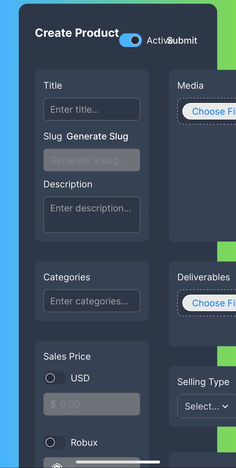
When I set it to 1 column it just overlaps like this:

and the actual site where I am building this is behind authentication so it would be difficult to share
Oh I see, I think it’s because one/some of the grid children has an explicit position set of column 2
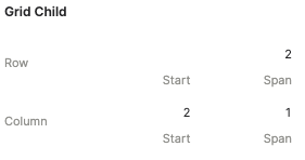
This forces the entire grid to be at least 2 columns - it’s just how CSS grid works
We actually currently don’t yet support unsetting the grid child settings selectively, it’s a bug that @fmota is fixing - the easiest workaround is to recreate that one div for now and drag its contents in
Ok awesome, thank you for the workaround!
So for my mobile screen variant I could just make a separate vertical div and put the boxes into that for now?
I think it’s something like the third or fourth grid child that has a position of column two set
That’s the only one you need to update/replace
Ok awesome, thank you!