I’m trying to design a page that is responsive, but also has continuous background expansion. Right now I set my page to a max width of 1440px so my content does not get stretched out at larger screens, and a breakpoint at a pixel width of 1280.
The issue I run into is that when I set a max pixel width, the background will not extend and be filled with a white background.
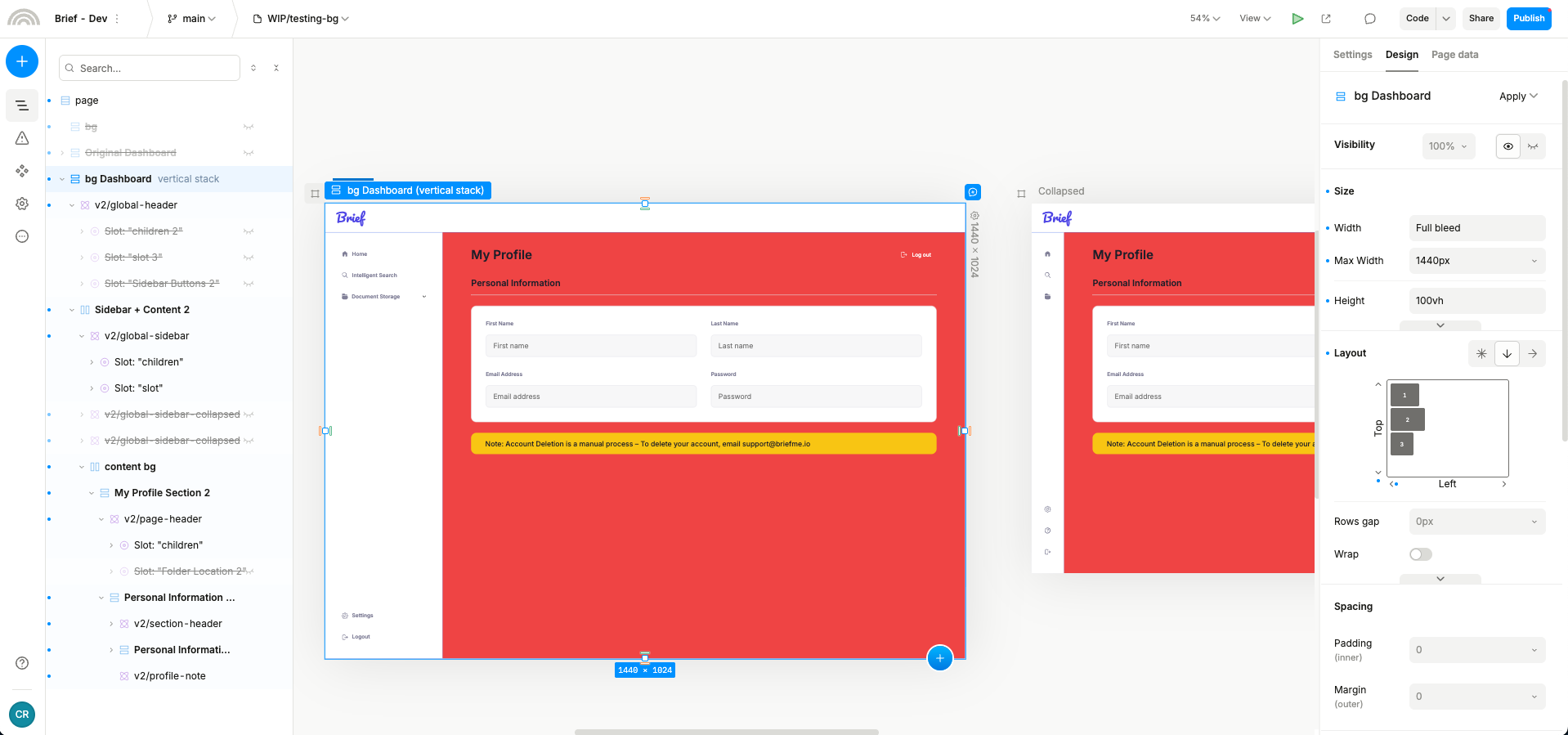
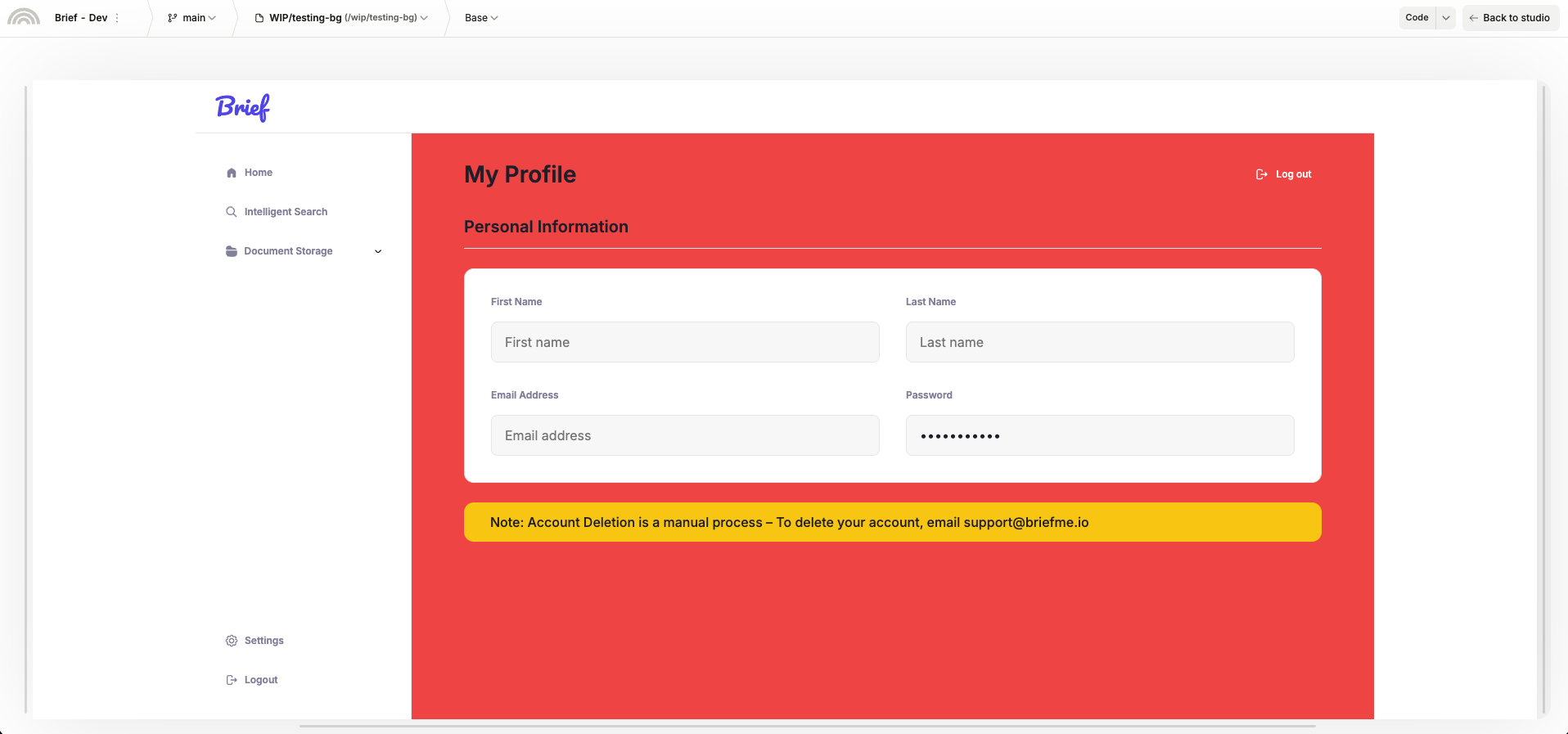
If I remove this limit and set the bounds to my content, my background colors will extend, but now only from the right side and not keep all of my content aligned.
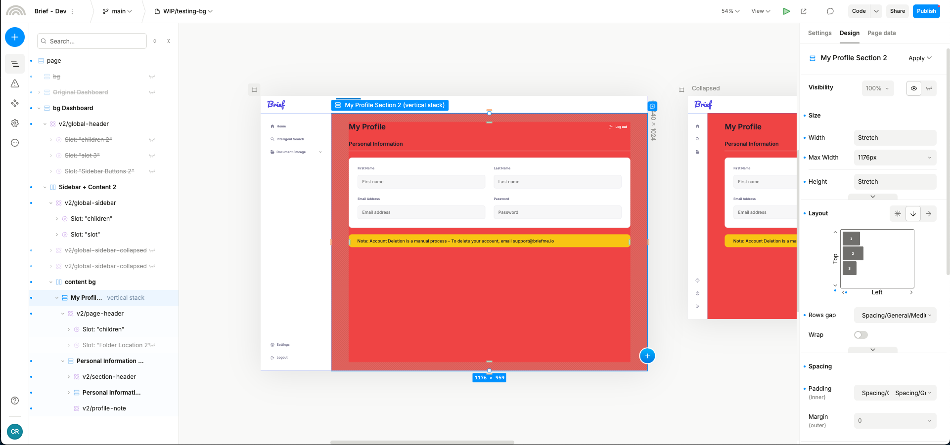

Is there a solution to where I can maintain the bounds of my content, but still have the different colors extend from left and right when expanding on larger screen sizes?