Hello Plasmicians,
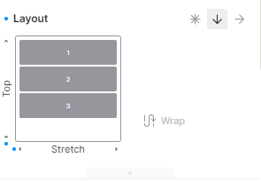
The register code component doesn’t support Column/Row Gap. Am I missing something in the docs or it’s just not supported by design? PFA
Thanks
Hello Plasmicians,
The register code component doesn’t support Column/Row Gap. Am I missing something in the docs or it’s just not supported by design? PFA
Thanks
Looking for support for this as well
Yeah, I think we are missing something. I tried the same Column/Row gap in defaultStyles but got the same error as you shared in the channel.
Because we’re using “simulated” column / row gap, which requires some wrapping divs, we can’t automatically make this work for code components (hence why it is disabled) 
• Is there a reason the Plasmic simulates column / row gap versus just using the native property?
• What if you were to expose a new type in the component registration and allow usage of a Component that is exported from the plasmic package? This could prevent any potential breakage / confusion.
◦ PlasmicDiv instead of <div className={classNames('air-form__row', PLASMIC_DEFAULT_CLASS_ALL, className)}>{children}</div>
◦ PlasmicButton instead of <a className={classNames('air-button', PLASMIC_DEFAULT_CLASS_BUTTON, className)}>{children}</a>
flexbox gap only recently became more widely supported, and only then it’s just at ~88%… so we are still simulating it for now. We’re thinking about allowing some projects to opt into using native gap though.
Not sure what you mean by the “type” idea…?
The type idea is to prevent limiting the studios functionality of code components. In the case of gap, I can see the reasoning for disabling it because you never know what code components are, and in the case you have an input, you wouldn’t be able to nest children inside of it and allowing gap there would cause spacing issues due to simulating gap via margins. Instead utilize types or elementTypes to set the root element, and exposing Plasmic components with default styles/classes.
The benefits here would be:
• Code components can communicate to studio on what can be edit
• Studio styles panel would show based on the element type, similar to how studio does when changing Element Tags
• PlasmicComponents would come with all the className / divs that are required to simulate gap and any other properties that you’re simulating for browser support
export const Component = () => {
  return (
    <RandomComponent>
      <PlasmicElement.Nav className={className}>
        {children}
      </PlasmicElement.Nav>
    </RandomComponent>
  );
}

export COMPONENT_META = {
  elementType: PlasmicElementEnum.nav,
  name: 'Component',
  props: {
    children: {
      type: 'slot',
    },
  },
}

export const Input = ({ className }) => {
  return (
    <PlasmicElement.Input className={className} />
  );
}

export INPUT_META = {
  elementType: PlasmicElementEnum.input,
  name: 'Component',
  props: {
    children: {
      type: 'slot',
    },
  },
}