I’m trying to edit the ‘Text Input’ component tool that Plasmic has set up to allow for icons within the input box, similar to how the ‘Input’ component allows for prefix and suffix slots for icons. I’m wanting to stick with the Text Input since it’s being across the entirety of my site and wired in on the engineering side of things.
Any attempt at editing the ‘Text Input’ causes for an error message letting me know it’s not possible to place anything inside.
I’ve managed to develop a workaround by combining the input with a button component and making sure the combined sides are flat to look like a uniform input bar. However, the issue still becomes clear when typing since the input bar will be the only part “highlighted” or change to a blue border. You can see in the photos how weird it looks when contrasted with the ‘Input’ component.
I’m sure there’s a potential workaround of creating a component out of the ‘Text Input’ and Button that changes states to a blue bordered design when the input area is clicked, but I figured seeing if there’s a way to add a slot or icon to the ‘Text Input’ Plasmic component would be much more simple. Any help is greatly appreciated. Thanks!
Hey @christian_ramos
Text Input uses Aria Input which provides base <input /> element which cannot have children. It can be used in other components to create custom text input fields such as the built-in Text Field component.
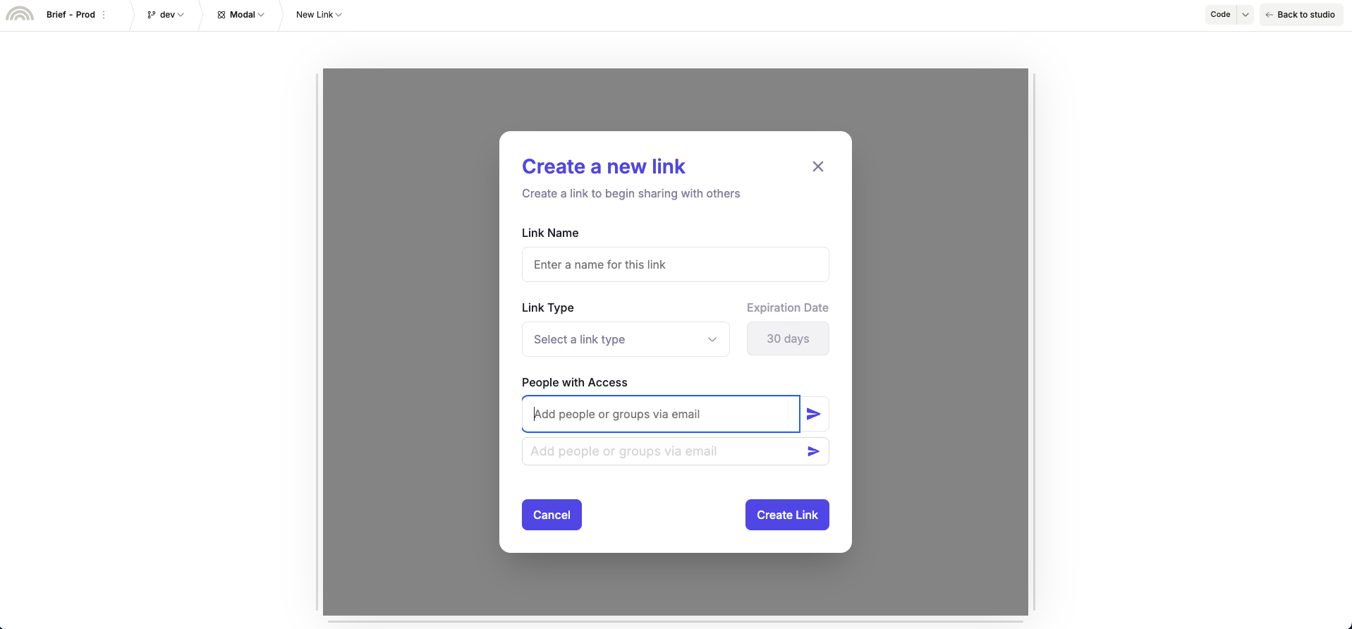
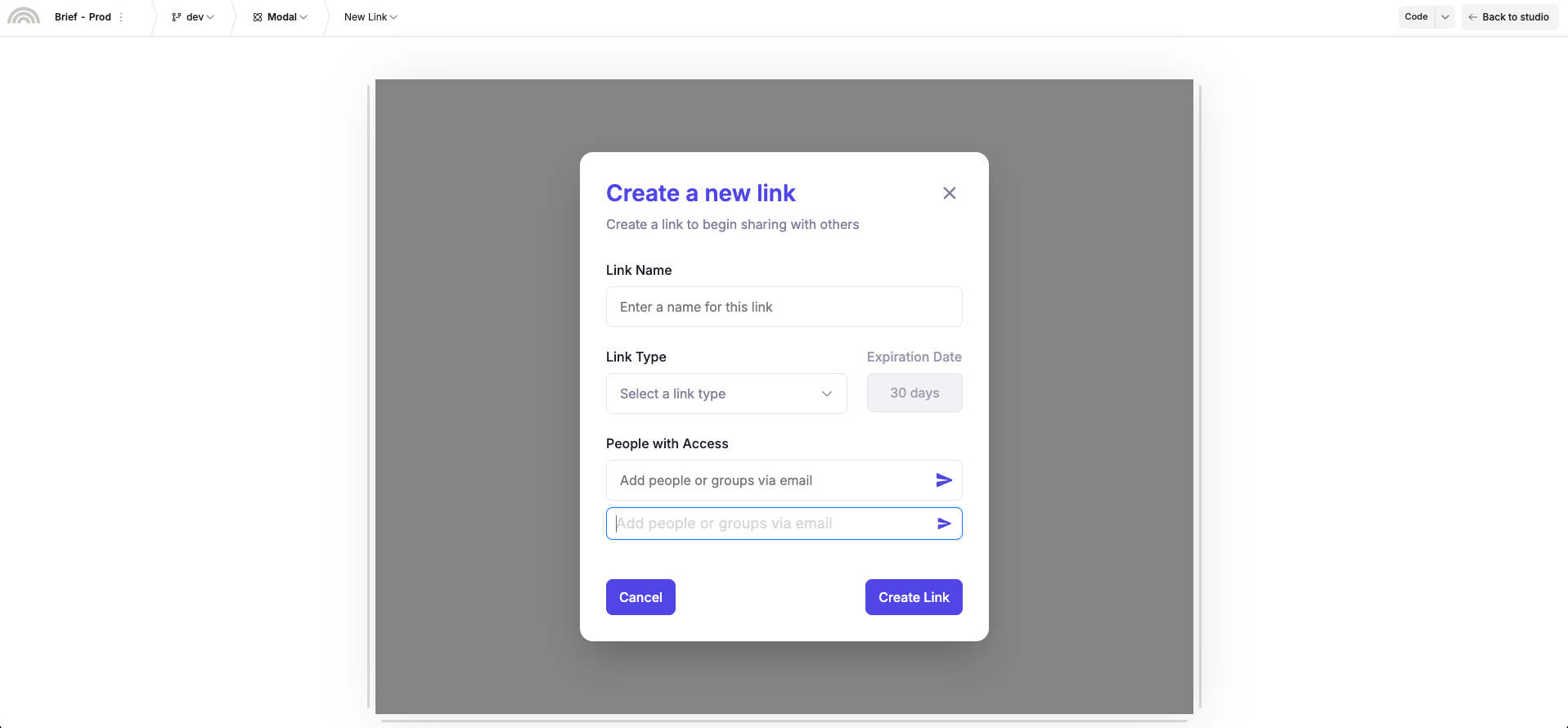
Regarding the custom Text Input component with a button component, could you please confirm that all sides were added in the Flat prop. Here is an example of Custom Text Input with all sides being flat.
The root horizontal stack element width is set to hug-content in the example below.
Let me know if this helps.
Thanks
Hey @christian_ramos
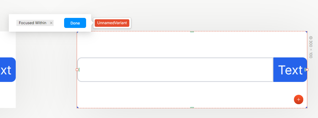
You’re approach is part way there. The blue outline on the text input comes from the focused state. You’ll need to style the :focused-within pseudo selector to style the parent (in this instance, your horizontal stack with the text-input and button as children) when any of the children are in :focused state. (Note: there is a slight bug in the plasmic UI that shows as UnnamedVariant here @muhammad_asim @alex_noel )
The difference between the :focused pseudo-selector and the :focused-within pseudo selector is that the former styles the element when the element itself is focused (the stack doesn’t have a focused state) whereas the latter stylers the parent when any child elements are focused (in this instance, styling the stack when the text-input is focused)
Here is the result when the cursor is in the input box:
Is that what you wanted to achieve? Here is an example: Plasmic
1 Like