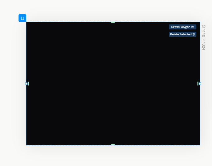
Here I am using dark mode, so my element uses a black background. This gets a bit annoying when I’m trying to design for light mode, because I have to change my browser’s color mode to get realistic results. Even if an element shows black like this, when it’s actually rendered it’ll default to white.
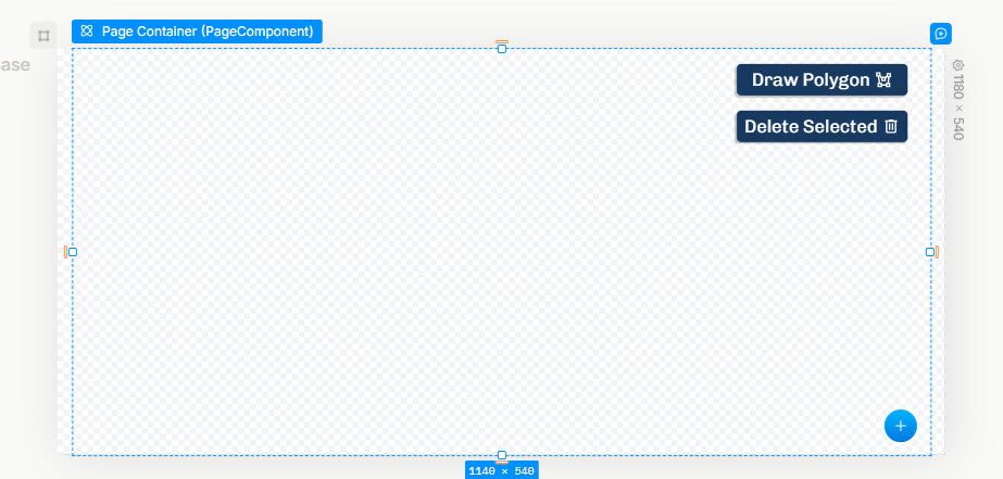
If it’s not checkered, it means the app will be filling in a color, in this case your white/black background based on your system theme. So I think this part is working as expected.
I’m a bit confused. When you say “dark mode support,” do you mean we’ll be able to preview light mode and dark mode versions of the designs? Or is it more like the UI Plasmic Studio uses will have dark mode compatibility? The former would resolve the issue, but the latter would leave it the same– you’d still have to change your browser’s color mode to preview what it would look like to the users.