Changing this option while setting up a component, does nothing.
Is this something expected?
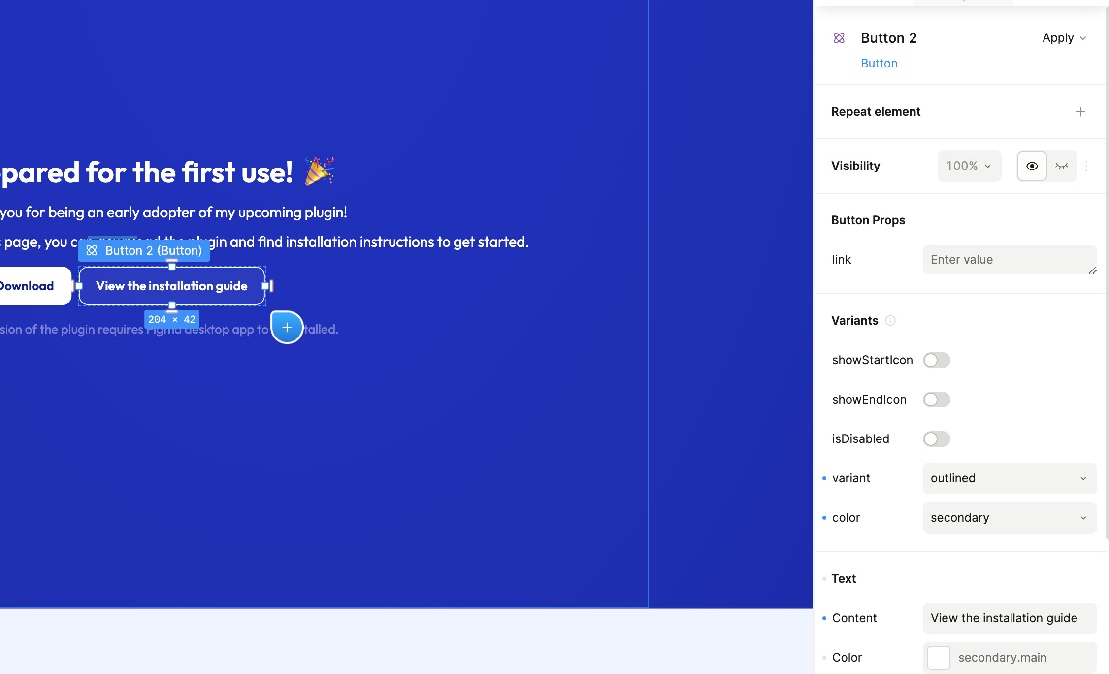
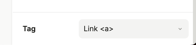
I’m trying to change the button to generate an a tag, instead of button since i cannot make it scroll to a specific section by targeting an id.
Changing this option while setting up a component, does nothing.
Is this something expected?
I’m trying to change the button to generate an a tag, instead of button since i cannot make it scroll to a specific section by targeting an id.
Hey @impressive_cardinal!
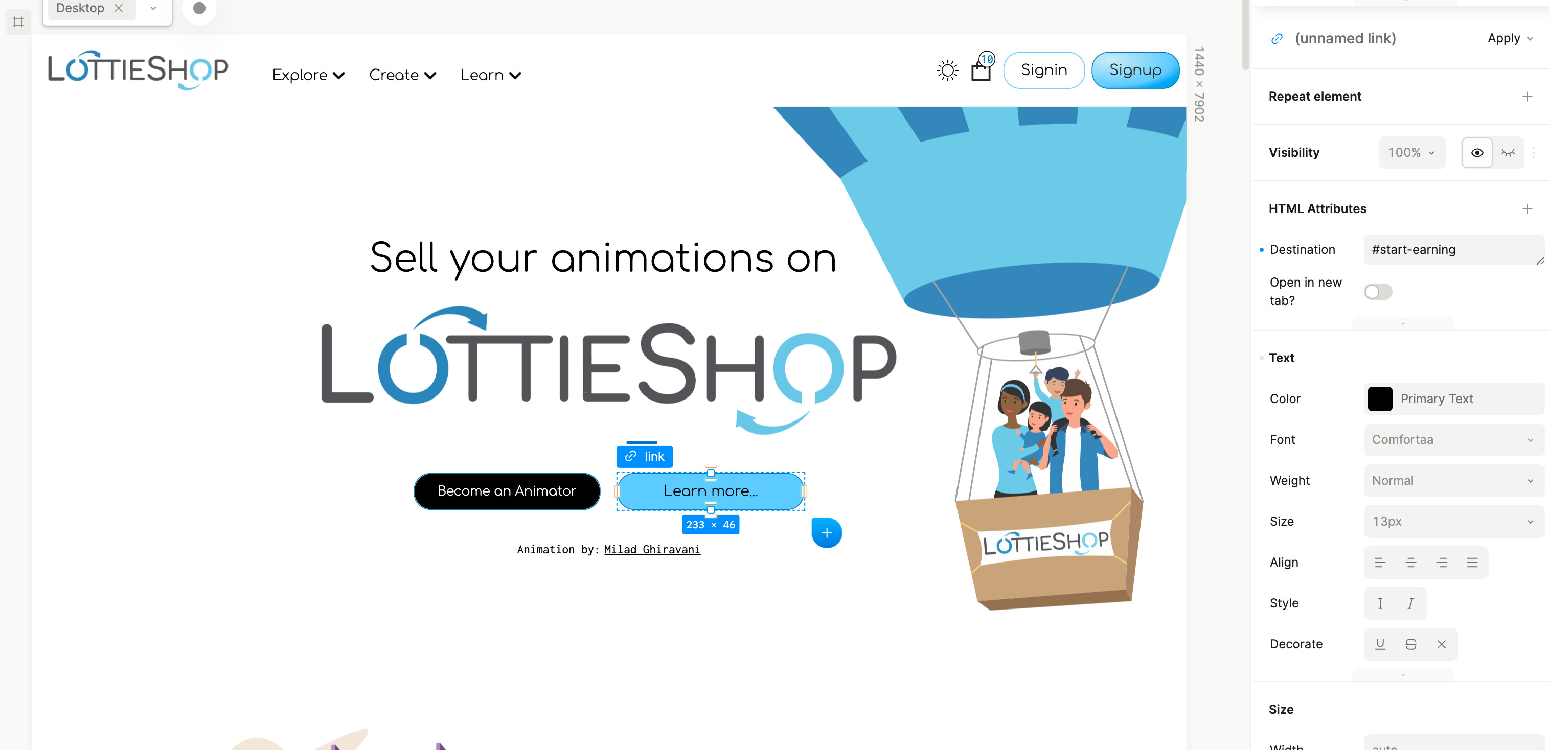
Take a look at the attached images. After you change the element to an , you’ll see a prop named Destination . You can see in our image the value is set to #start-earning .
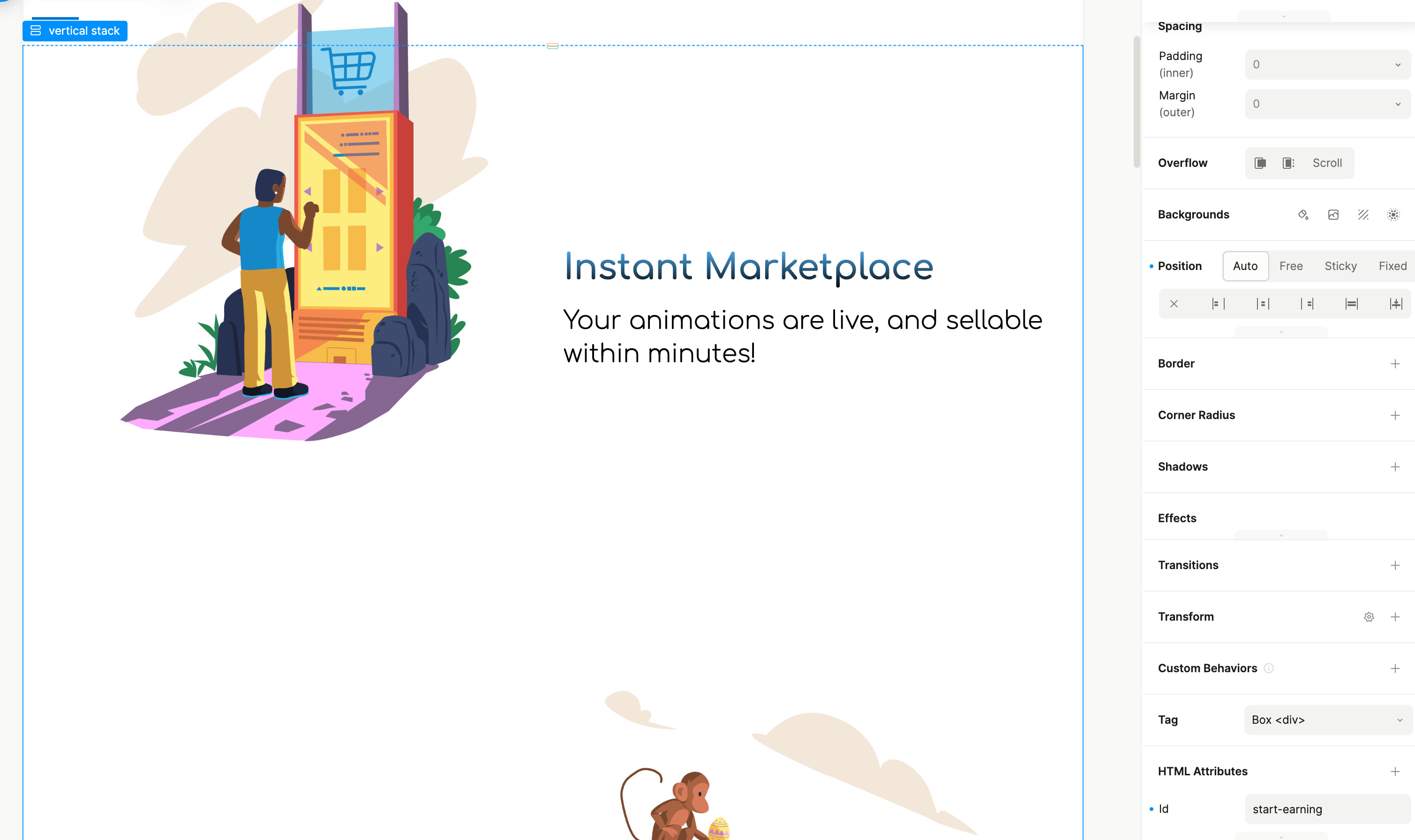
Then, in the second image you’ll see that you add an HTML attribute id to the destination element, and set it with a matching value, like start-earning
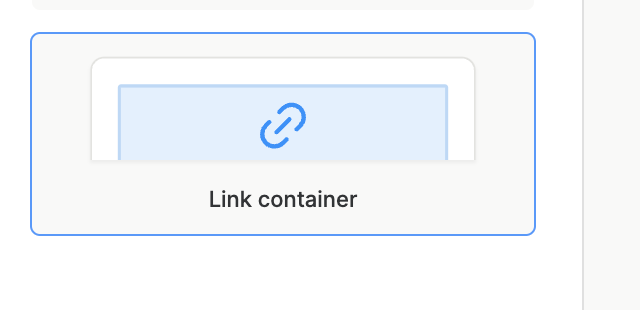
Yeah, a link container is one method that you can use!
Where, you can wrap an instantiation of a component in a link container. That provides some additional flexibility with a button component.
On the component itself, you could also wrap the button element with a parent link container, and convert the link to a slot target, providing you with the flexibility changing the value of the link at each instance of a button.
I could achieve the desired behaviour with the link container, but is a bit overkill. 
I was a bit surprised to see that button tags, by default do not support that behaviour of a href="id" .
But, maybe it created for forms.
Anyway, thank you for help! 
Do know by any chance, if I can set default variants for the button?
For example:
<Button>
===
<Button variant="contained" color="primary">
I’m referring to the plasmic UI
A component’s default would be base
Then, you would create variant groups, and variants as variations of that base component.
So, you may have a variant group where “contained” is boolean set to false
And, then you would have the primary color set at the base of the component, and another variant group named color with different options.
So there is no way to replicate this:
https://mui.com/material-ui/react-button/
I’m referring strictly to the default values, when you drag and drop a component from the Insert menu.
I understand what you’re saying, and perhaps it’s an interesting feature to propose to Plasmic in the ideas channel, where you would have a flag on a component that would set a specific variant, or combination of variants as the default when creating the instantiation.
Right now, there are work arounds, either when creating a component within Studio, or registering a code component like a MUI button. In any event, the “default” would be the “base” component.
When you register a code component (if you’re using codegen), you can use the defaultValue prop inside of your plasmic-host.tsx to kick things off.
I discovered an issue when you wrap the button with an a …
You end up focusing twice on the same element.
 I found the solution by using the
 Destination of the Button and is pretty simple:
• instead of using only the id as it is with the a tag
• use /route#id in the Destination field
this is the much faster solution I was talking about some days ago, I finally found time to record this video for you
this is exactly what i’ve done, but it didn’t work at first only with the id and i had to include page route as well :man-shrugging:
I didn’t make the anchor on the homepage, that may be a possible reason… :man-shrugging: