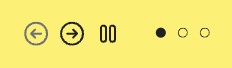
Hey guys! is it possible to modify/stylish dots and arrows on the new react-slick component? I did try to do it, but couldn’t find a way, but maybe its because I have -1 skills as a designer and in design tools 
1 Like
ps: to look like this:
1 Like
The React-Slick doesn’t support custom arrows and custom dots at the moment.
I have done a custom solution for it by registering custom code component for react-slick. It supports custom arrow and custom dots component.
I will share my solution in an hour. I am away from laptop.
import React, { useRef } from "react";

import ReactSlickSlider from "react-slick";
import { registerComponent } from "@plasmicapp/host";

const CustomSlide = ({ children, slideWrapperStyle, isCentered }) => {
  return (
    <div style={{ ...slideWrapperStyle }}>
      {React.isValidElement(children)
        ? React.cloneElement(children, { isCentered })
        : null}
    </div>
  );
};

const Slider = ({
  className,
  children,
  dotSlot,
  sliderWrapperStyle,
  dotSlotWrapperStyle,
  slideWrapperStyle,
  arrows,
  nextArrow,
  prevArrow,
  onCurrentSlideChange,
  ...props
}) => {
  const sliderRef = useRef();
  const [currentSlide, setCurrentSlide] = React.useState(0);

  const settings = {
    ...props,
    arrows: false,
    appendDots: (dots) => {
      const isValidDotSlot = React.isValidElement(dotSlot);
      if (!isValidDotSlot) return <ul>{dots}</ul>;

      return (
        <div style={dotSlotWrapperStyle}>
          {dots?.map((dot) => {
            const dotProps = {
              isActive: dot?.props?.className === "slick-active",
            };

            return React.cloneElement(dotSlot, { ...dotProps });
          })}
        </div>
      );
    },
    afterChange: (current) => setCurrentSlide(current),
  };

  React.useEffect(() => {
    onCurrentSlideChange && onCurrentSlideChange(currentSlide);
  }, [currentSlide]);

  const onPrev = () => {
    if (!sliderRef.current) return;
    sliderRef.current.slickPrev();
  };

  const onNext = () => {
    if (!sliderRef.current) return;
    sliderRef.current.slickNext();
  };

  const centerSlideIndex =
    (Math.floor(props.slidesToShow / 2) + currentSlide) %
    React.Children.count(children);

  return (
    <div style={sliderWrapperStyle}>
      {arrows && React.isValidElement(prevArrow)
        ? React.cloneElement(prevArrow, { onClick: onPrev })
        : null}
      <ReactSlickSlider className={className} {...settings} ref={sliderRef}>
        {React.Children.map(children, (child, index) => {
          return (
            <CustomSlide
              index={index}
              isCentered={index === centerSlideIndex}
              slideWrapperStyle={slideWrapperStyle}
            >
              {child}
            </CustomSlide>
          );
        })}
      </ReactSlickSlider>
      {arrows && React.isValidElement(nextArrow)
        ? React.cloneElement(nextArrow, { onClick: onNext })
        : null}
    </div>
  );
};

export default Slider;

export const registerSlider = () => {
  registerComponent(Slider, {
    name: "Slider",
    displayName: "Slider",
    importPath: "./code-components/Slider/Slider",
    importName: "Slider",
    isDefaultExport: true,
    props: {
      children: {
        type: "slot",
        defaultValue: [
          {
            type: "img",
            src: "<https://via.placeholder.com/150x90/FF0000/FFFFFF/?text=Slide_1>",
            styles: {
              maxWidth: "100%",
            },
          },
          {
            type: "img",
            src: "<https://via.placeholder.com/150x90/00FF00/FFFFFF/?text=Slide_2>",
            styles: {
              maxWidth: "100%",
            },
          },
          {
            type: "img",
            src: "<https://via.placeholder.com/150x90/0000FF/FFFFFF/?text=Slide_3>",
            styles: {
              maxWidth: "100%",
            },
          },
        ],
      },
      dotSlot: {
        type: "slot",
        hidePlaceholder: true,
      },
      dotSlotWrapperStyle: {
        type: "object",
        defaultValue: {
          display: "flex",
          justifyContent: "center",
          alignItems: "center",
          columnGap: "16px",
          width: "100%",
        },
      },
      sliderWrapperStyle: {
        type: "object",
        defaultValue: {
          display: "flex",
          justifyContent: "center",
          alignItems: "center",
          columnGap: "16px",
          width: "100%",
        },
      },
      slideWrapperStyle: {
        type: "object",
        defaultValue: {
          padding: "16px",
        },
      },
      nextArrow: {
        type: "slot",
        defaultValue: [
          {
            type: "button",
            value: "Next",
          },
        ],
      },
      prevArrow: {
        type: "slot",
        defaultValue: [
          {
            type: "button",
            value: "Prev",
          },
        ],
      },
      arrows: {
        displayName: "Arrows",
        type: "boolean",
        description: "Show next/prev arrows",
        defaultValue: true,
        defaultValueHint: true,
      },
      autoplay: {
        displayName: "Auto Play",
        type: "boolean",
        description: "Automatically start scrolling",
        defaultValueHint: false,
      },
      autoplaySpeed: {
        displayName: "Auto Play Speed",
        type: "number",
        description: "Delay between each auto scroll, in milliseconds",
        defaultValueHint: 3000,
        hidden: (props) => !props.autoplay,
      },
      dots: {
        displayName: "Dots",
        type: "boolean",
        description: "Show dots for each slide",
        defaultValueHint: false,
      },
      easing: {
        displayName: "Easing",
        type: "string",
        description: "Easing method for transition",
        defaultValueHint: "linear",
      },
      fade: {
        displayName: "Fade",
        type: "boolean",
        description: "Cross-fade between slides",
        defaultValueHint: false,
      },
      focusOnSelect: {
        displayName: "Focus On Select",
        type: "boolean",
        description: "Go to slide on click",
        defaultValueHint: false,
      },
      infinite: {
        displayName: "Infinite",
        type: "boolean",
        description: "Infinitely wrap around contents",
        defaultValueHint: true,
      },
      initialSlide: {
        displayName: "Initial Slide",
        type: "number",
        description: "Index of initial slide",
        defaultValueHint: 0,
      },
      lazyLoad: {
        displayName: "Lazy Load",
        type: "choice",
        options: ["ondemand", "progressive"],
        description:
          "Load images or render components on demand or progressively",
      },
      pauseOnDotsHover: {
        displayName: "Pause On Dots Hover",
        type: "boolean",
        description: "Prevents autoplay while hovering on dots",
        defaultValueHint: false,
      },
      pauseOnFocus: {
        displayName: "Pause On Focus",
        type: "boolean",
        description: "Prevents autoplay while focused on slides",
        defaultValueHint: false,
      },
      pauseOnHover: {
        displayName: "Pause On Hover",
        type: "boolean",
        description: "Prevents autoplay while hovering on track",
        defaultValueHint: true,
      },
      rows: {
        displayName: "Rows",
        type: "number",
        description: "Number of rows per slide (enables grid mode)",
        defaultValueHint: 1,
      },
      rtl: {
        displayName: "Reverse",
        type: "boolean",
        description: "Reverses the slide order",
        defaultValueHint: false,
      },
      slidesPerRow: {
        displayName: "Slides Per Row",
        type: "number",
        description:
          "Number of slides to display in grid mode, this is useful with rows option",
        defaultValueHint: 1,
      },
      slidesToScroll: {
        displayName: "Slides To Scroll",
        type: "number",
        description: "Number of slides to scroll at once",
        defaultValueHint: 1,
      },
      slidesToShow: {
        displayName: "Slides To Show",
        type: "number",
        description: "Number of slides to show in one frame",
        defaultValueHint: 1,
      },
      speed: {
        displayName: "Speed",
        type: "number",
        description: "Transition speed in milliseconds",
        defaultValueHint: 500,
      },
      swipe: {
        displayName: "Swipe",
        type: "boolean",
        description: "Enable swiping to change slides",
        defaultValueHint: true,
      },
      swipeToSlide: {
        displayName: "Swipe To Slide",
        type: "boolean",
        description: "Enable drag/swipe irrespective of 'slidesToScroll'",
        defaultValueHint: false,
      },
      touchMove: {
        displayName: "Touch Move",
        type: "boolean",
        description: "Enable slide moving on touch",
        defaultValueHint: true,
      },
      touchThreshold: {
        displayName: "Touch Threshold",
        type: "number",
        description: "Swipe distance threshold in pixels",
        defaultValueHint: 5,
      },
      useCSS: {
        displayName: "Use CSS",
        type: "boolean",
        description: "Enable/Disable CSS Transitions",
        defaultValueHint: true,
      },
      useTransform: {
        displayName: "Use Transform",
        type: "boolean",
        description: "Enable/Disable CSS Transforms",
        defaultValueHint: true,
      },
      variableWidth: {
        displayName: "Variable Width",
        type: "boolean",
        description: "Variable width slides",
        defaultValueHint: false,
      },
      vertical: {
        displayName: "Vertical",
        type: "boolean",
        description: "Vertical slide mode",
        defaultValueHint: false,
      },
    },
    defaultStyles: {
      width: "stretch",
      maxWidth: "100%",
    },
  });
};
- Setup App Host to support custom code components
- Save the above file somewhere under src directory
- Change the
importPathproperty to match your path - Call the
registerSliderfunction in plasmic-host file to register the code component.
1 Like
You can read more about code-components here.
https://docs.plasmic.app/learn/code-components/
Also, You can watch my video on how to register code components.
https://www.youtube.com/watch?v=v8R0NwedW_4
Let me know if you need specific help in the above Slider component. You will need to layout the prevArrow and nextArrow slots differently as per your requirements. Currently, it lay them to the left and right of the Slider
thanks a looot  life saver
@hidden_bear reference to Custom Slick Component.
Please let me know if you have any questions regarding this.
This is awesome. Will try implementing it! In the meanwhile, does this implementation include captions?
It doesn’t include Captions, but they can be added as well.
Ok, curious, watching through the video—I see there’s either codegen or registering react components. Is it possible to integrate if I don’t have an external codebase?
- Set up your app host url so you can run Plasmic Studio within your own React application.
- Register your code components so Plasmic knows how to use them.
Eg. what if I’m not ready to have an app host URL for instance
1 Like
You can point the app host URL to localhost during development, which don’t require you to have an online domain first, if that’s what you meant by not being ready to app host url.
Will see what happens, gotta run through some tutorials first