@chungwu
how could I miss that! (sometimes you should just close the laptop and go to sleep … :D)
I was able to scale the image properly after all.
Although initially I planned to scale just the image, hoping the hugging root would adjust. I would love to understand why it didn’t.
But this is what I ended up with:
(I also observed, that width wouldn’t respond to % and I had to set the base value in px. Perhaps ist is worth understanding why?)
Anyway… I’m now trying to figure out, how I can scale the font size(s).
I would override each slot font-size, if that’s what it takes.
Even tried to access a slot style with wrapChildren on it’s container. But it won’t trickle down.
which I’ve tried with wrapChildren on individual slots
videoTitle={{
    wrapChildren: (children) =>
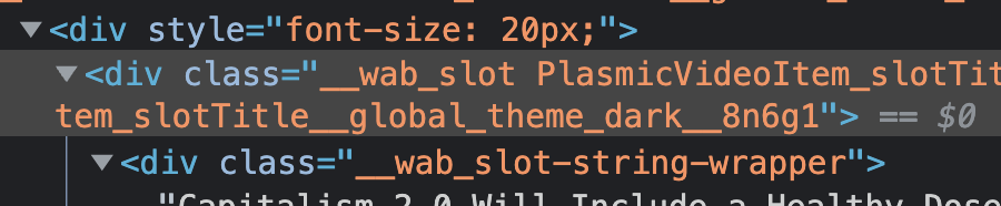
But as you can see in the img above, that wrapping div ( which was given a font size of 20px ) is not immediately above the slot div and the style doesn’t cascade down
Alright that works. but the grid loads significantly faster when don’t override multiple(or just one!) text slot styles to change its height, fontsize and lineheight.
I wish there was a faster way to put a factor on all styles of a category for all children. I was looking for something using !important and rem values, but I think I’m out of luck.
I guess I’ll end up using variants for different sizes, based on the available slot width ranges.
I found out, that I was mistaking rem for em.
Now using em, I’m only changing the fontsize of the root and let everything react.
Almost perfect. Now I’ll try to improve the performance.
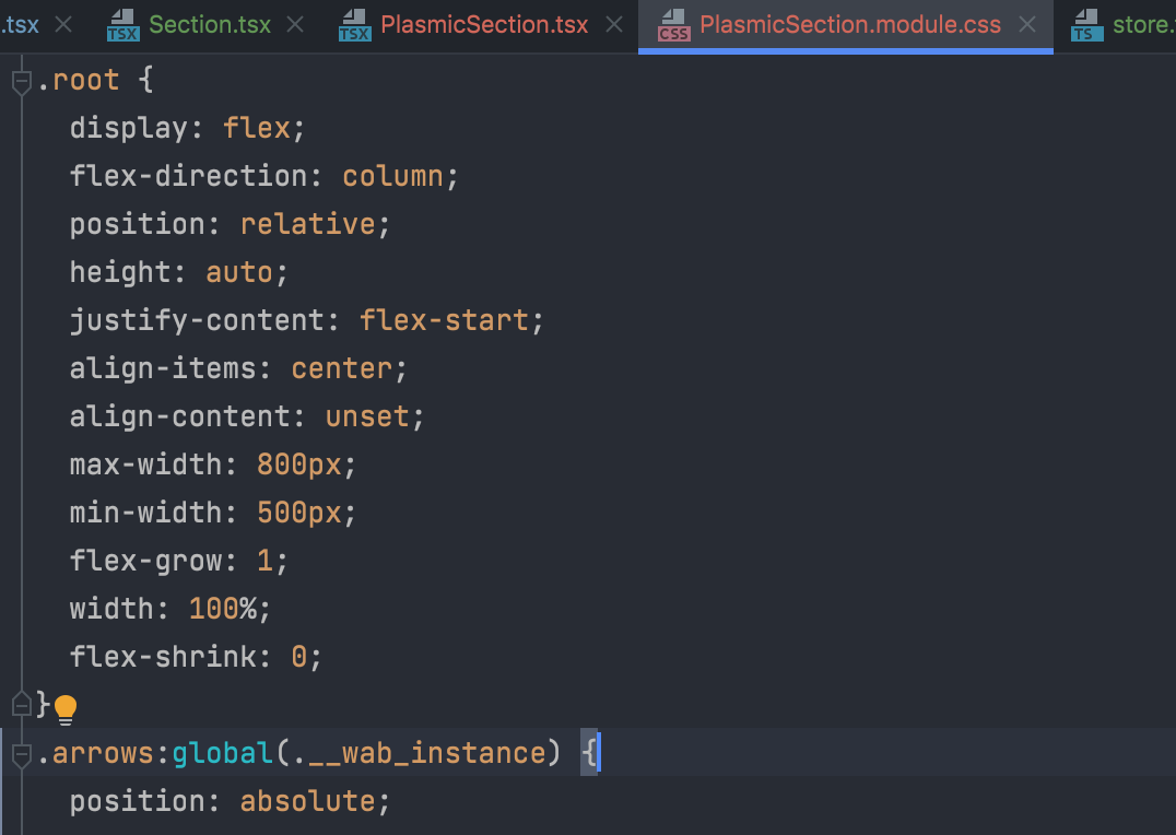
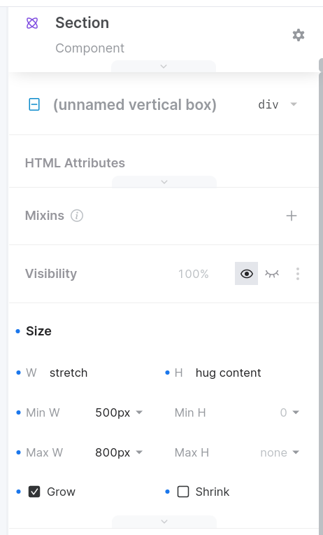
@chungwu so far, I always had a fixed width for a Section component.
I would like to set the width to stretch, bounded by min max values.
The problem is, that the component then starts out with the min width and then expands a second later or once its contentcontainer is filled.
You can try using useLayoutEffect() instead of useEffect() when figuring out the size of your Section component, so that you can immediately re-render after the DOM has been mutated
at the end of the video, I observe, that the section component is still being rendered to the former min-width of 500px. Even after I set a fixed width of 800px and synced it. And after restarting the app completely.
ok, refreshing plasmic brought back the values shown in your screenshot.
So for some reason during my recording, changes in the plasmic UI didn’t stay persistent.
Anyway, I just wanted to show you that with a fixed value of 800, my code has no trouble getting the width to determine the itemSizeFactor which I need to give the items an appropriate (font)size
 can you show me your code for getting the width?