hi again! have 2 questions I’m hoping you can help me with:
if I have some data-providing component that can tell me e.g. if the currently logged-in user is a “member” or not, is it possible for me to create a child component of this provider directly in plasmic that shows / hides itself based on that value? If not, are there any recommended practices for building and using code components that handle this logic? Right now this is my component structure, but I’m worried that it’s not very intuitive for someone hoping to create e.g. a button that hides itself if a user isn’t a member:
<UserProvider>   // fetches membership data about the current user + puts it on the react context
  <VerticalStack>
    <MemberProvider/>   // shows or hides itself based on the value in the react context
    <NonMemberProvider/>   // shows or hides itself based on the value in the react context
  </VerticalStack>
</UserProvider>
is there a recommended way / is it possible to dynamically populate valid props for a component? e.g. if I wanted to show a dropdown of 10 different ids in the plasmic studio, but I wanted those ids to be determined at the time that the user loads the page. I know I can specify lists, like with the below example from the docs, but does this work dynamically?
    elevation: {
      type: 'choice',
      options: ['high', 'medium', 'flat']   // I want these to come from a db query issued at the time that the page loads
    }
There are multiple ways to achieve the 1st point. I would do it in the following ways
Register Custom Code Component that will render children conditionally based on the current user type. Pseudocode for that component
const MemberCondition = ({ children, hide = true }) => {
  // get the user from existing context
  const user = useAuthContext()
  // check if user is member
  const isMember = user.type === 'member'
  // XOR operator
  const showChildren = isMember != hide
  if (!showChildren) return null

  return children
}
Inside the Plasmic Studio, you can now wrap the elements in this component and set the property hide to true/false according to requirements.
Oh, I thought you asked for a solution to support that kind of functionality. Yeahh so, I am just sharing my thoughts on multiple ways to do it. I think this seems to be simple approach. Also, you can utilize the isAttachment prop of Code Components API to make it more usable from the usage point of view. They will appear in the Custom Behaviors section to the right.
The downside of using Global variant is that it can only be used inside Components which means if you want to show/hide some content it must be first converted to a component. Whereas the above code components can be directly used within the Page on a native plasmic elements such as input, button, text, hstack, vstack etc.
I’m still not sure how I would apply the right variant at the right time. If I create a member variant that is visible, and a nonmember variant that isn’t visible, how do I selectively add the variant based on the value of a prop in a parent?
When we create a Global variant inside the studio and then sync the code to our project it will create a React Context for that particular global variant.
Let’s say we add a global variant of type single select with the following name UserType and option Member
We will get a react context inside our plasmic directory
We can then add a that context at the root of the app inside _app.tsx to provide value to every page.
We can then use it as normal react context and update the userType from child components. The UI will automatically get the updated value and re-render itself.
P.S
You will be using that context inside your auth module to set the userType to “Member” when a member logins successfully.
Hi @reasonable_sheep , if you just want to conditionally show or hide some content based on whether the user is logged in, I think you all pretty much got it, but I’ll try to describe in different words just in case this is one simple approach (I probably wouldn’t start with variants first):
In your code base, provide a react context for membership. You don’t need to make this drag and drop in the plasmic editor, it’s just always there as part of your app.
Register a code component that simply reads this context, takes a children slot, and either shows or hides children. This is a simple wrapper component that doesn’t render any divs itself.
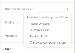
To make this a bit more intuitive to use, you can turn it into an attachment so that it shows up as a custom behavior, as y’all already touched on earlier. This means that users can select their button, go to the right pain, and choose to make it conditionally shown, without thinking as explicitly about nesting. https://docs.plasmic.app/learn/registering-code-components/#custom-behaviors-attachments
For the convenience of your editors, I would add another prop that is only used at edit time, which can force the children to be shown/hidden even if it normally wouldn’t be because of the users logged in state. That way your editors can design in the different states without needing to actually log out or in, or do contortions like moving the children in and out of the wrapper. https://docs.plasmic.app/learn/writing-code-components/#detect-if-your-component-is-rendering-in-plasmic-studio
Let me know if that makes sense!
 this is one simple approach (I probably wouldn’t start with variants first):