Some ux feedback, the icon for “Imported projects” in the left toolbar is totally not what I expected! It took like 5 mins of hunting around and googling to find this

I now understand this is intended to be an “import” icon
But something like “packages” or “library” woiuld have been way more intuitive for me
I agree. We’ve considered “libraries,” but it’s meant to mean “import any project,” and a project isn’t necessarily just a library.
Where our icon sort of came from: https://thenounproject.com/search/icons/?iconspage=1&q=import
yeah i get it but I wonder if you guys are overthinking it ![]()
We’re thinking showing labels to all these left icons by default and then users can collapse into a bar of icons like today.
Yeah +1 to that
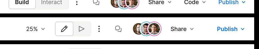
On the topic of the left panel, i’ve always found it weird that the multiplayer heads are in the bottom left, instead of the top right next to the Share button like figma, google docs, and every other app in the world ![]()
this pattern is so strong in my brain that for a while when I started using Plasmic, I actually wasn’t sure if it supported multiplayer