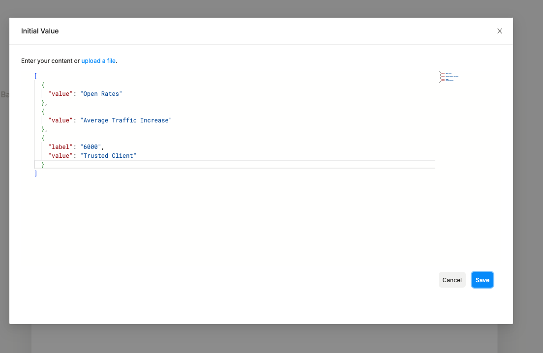
I think this component could benefit from some UI changes to distinguish which areas are the code area and separting it out from the component layer. It currently feels too blended without a great hierarchy setup.
I think the UI separation was inherant when there was still a dependency on the monaco editor, but now that is gone, the UI doesn’t feel like it is designed for what it is used for.