I’m really enjoying using the Flowbite GPT in ChatGPT for helping me design; it would be great if that capability existed directly within Plasmic; and the suggestions that I’m getting, I could check or x out whether or not I planned on implemented and (I know this an extreme request) there could be a workflow that guided me through the tool to make the changes, or the changes just happened for me when I clicked them.
I’m going to do my best to copy and paste my chat here since I can’t share the link based on the image being uploaded
To improve the design shown in the image, consider the following suggestions based on UI design principles and the capabilities of the Flowbite Library and Tailwind CSS:
- Hierarchy and Spacing: Enhance visual hierarchy by adjusting the spacing between elements. Make sure there’s enough whitespace to allow each section to breathe, thus improving readability.
- Typography: Experiment with different font weights and sizes to create a clear distinction between headings, subheadings, and body text. This helps guide the user’s eye through the content.
- Color and Contrast: Use a color scheme that aligns with the brand but also ensures good contrast. For interactive elements like buttons, use colors that stand out against the background to draw attention.
- Button Styles: Use the Flowbite component styles to create more engaging buttons. Consider different shapes, shadows, or even animated effects on hover to make them more interactive.
- Consistency: Maintain consistency in button styles and text alignment. If there’s a primary action you want users to take, make that button more prominent.
- Imagery: If appropriate, include imagery or icons that align with the content to make the page more visually engaging.
- Grid Layout: Consider using a grid layout to organize content into sections that are easier to navigate visually.
- Responsive Design: Ensure the layout is responsive and looks good on all device sizes, using Tailwind’s responsive utilities.
- Interactive Elements: If applicable, add interactive elements like dropdowns, toggles, or tooltips with Flowbite to enhance user engagement.
- Social Proof: If this is a landing page, consider adding testimonials or logos of companies that use the product to increase credibility.
- Footer Information: Ensure the footer contains all the necessary information and is organized in a way that’s easy to navigate.
- SEO and Accessibility: Improve text for SEO, and make sure that the design is accessible by following WCAG guidelines, which could include proper alt text for images, accessible navigation, and more.
- Performance: Optimize images and assets to ensure the page loads quickly, which is crucial for user experience and SEO.
To implement these changes, you can utilize the various utilities and components that Flowbite and Tailwind CSS offer, like flexbox utilities for layout, typography utilities for text styling, and color utilities to apply a consistent and accessible color palette.
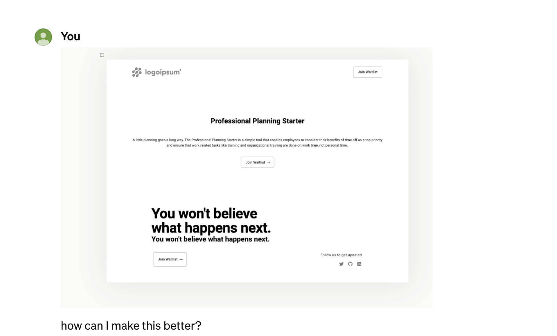
You
can you give me specific things I should do based on the image provided?
Flowbite GPT
Certainly! Here are specific suggestions to enhance the design shown in your image:
Typography and Text Layout:
• Headlines: Increase the font weight of your main headlines to make them stand out more. For instance, “Professional Planning Starter” can be bolder.
• Subheadlines: For the text below the main headline, consider a lighter weight or smaller size to create a clear distinction from the headline.
• Body Text: Ensure the body text has sufficient line-height for better readability. Tailwind CSS provides utilities like
• leading-relaxed
• for this purpose.
Color Scheme and Contrast:
• Background: If the background is plain, consider a slight off-white color to reduce the stark contrast with the text, which can be easier on the eyes.
• Buttons: Use a contrasting color for your “Join Waitlist” button to make it pop. For example, if your color scheme is blue, an orange button could stand out.
Buttons and Calls to Action:
• Primary Button: For the primary action, “Join Waitlist,” make sure it is the most prominent button. You can use Tailwind’s
• bg-indigo-600 hover:bg-indigo-700 classes for a nice effect.
• Secondary Button: If there are secondary actions, differentiate them with a less pronounced style, like outlined instead of filled.
Spacing and Layout:
• Padding: Add more padding around sections using p-8 or p-16 to give content more room.
• Alignment: Text and buttons seem center-aligned, consider left-aligning them in the containers for a cleaner look, particularly if this is a wider screen design.
Imagery and Icons:
• Logo: Ensure the logo is clearly visible and has enough space around it. If it’s clickable, make sure it has a hover effect like hover:opacity-90.
• Social Media Icons: Increase the size slightly and give them a uniform look. You can also add a hover effect with hover:text-indigo-600 for interactivity.
Interactivity and Feedback:
• Hover States: Add hover states to all buttons using Tailwind’s hover utilities, like hover:bg-opacity-75 for a subtle feedback effect.
• Active States: For the buttons, also define an active state with active:bg-indigo-800 to give users feedback when they click.
Responsive Design:
• Mobile-Friendly: Check how this design scales down on mobile. Use Tailwind’s responsive prefixes like md:, sm: to adjust padding, font sizes, and stack elements vertically on smaller screens.
Footer Information:
• Alignment: Align the footer content to the grid of the main content. It seems off-center compared to the elements above.
• Legibility: Ensure any text is legible and has a high contrast against its background for accessibility.
Performance and Accessibility:
• Image Optimization: If there are images, they should be optimized for web with proper resolution and compression.
• Accessible Text: Ensure all text meets accessibility standards for color contrast and font size.
Implementing these specific changes should lead to an improved overall design, better user interaction, and a more professional look and feel. Remember, with Tailwind CSS, you can apply these changes with utility classes directly in your HTML, which allows for rapid prototyping and iteration.
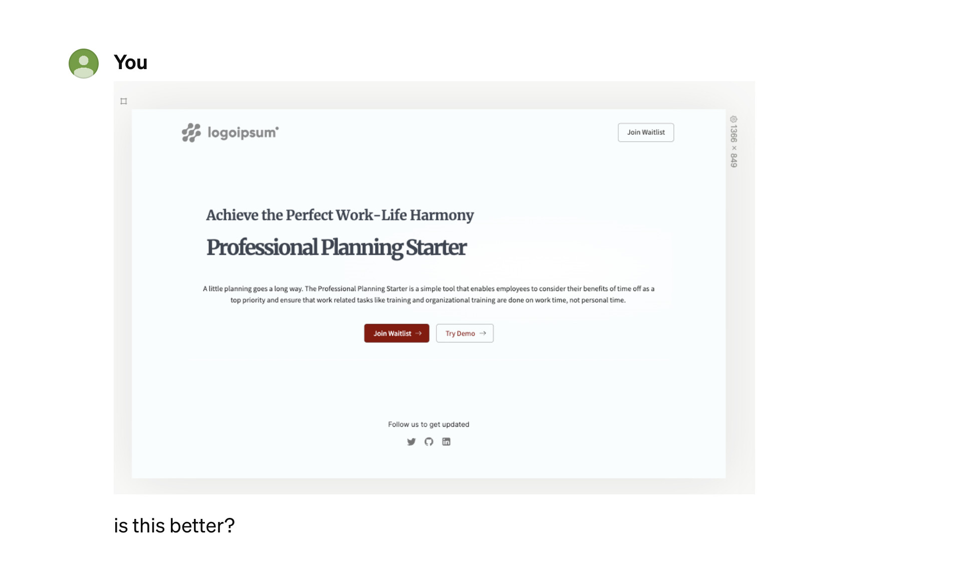
The updated design shows improvements in several areas such as additional buttons for user interaction and a more balanced layout. Here are some specific pointers to refine it further:
Typography:
• Title Contrast: The main title “Professional Planning Starter” could use a darker shade or a bolder weight to stand out more against the background.
• Subtitle Emphasis: The subtitle “Achieve the Perfect Work–Life Harmony” can be emphasized with a different color or font style to distinguish it from the main title.
Layout and Spacing:
• Button Spacing: There is now a second button “Try Demo,” which is good for user engagement. Ensure that there’s sufficient space between the two buttons so each one is recognized as an individual call-to-action.
• Consistent Margins: Check that the margins on the left and right of the text blocks are consistent to maintain a balanced look.
Color and Contrast:
• Button Colors: Consider using a primary color for the main call-to-action button “Join Waitlist” and a secondary, more subdued color for the “Try Demo” button to signify its relative importance.
• Background: The background remains plain, which works for a minimalist design. However, ensure that the color of the background contrasts well with the text for readability.
Interactivity:
• Button Interaction: Implement hover effects on the buttons to provide visual feedback when users interact with them, such as changing the background color or adding a shadow with Tailwind CSS classes.
Consistency:
• Font Consistency: Make sure that the font used for the buttons is the same as the one used for the body text to keep a unified look.
Visual Hierarchy:
• Header Sizes: The header “Professional Planning Starter” should be the most prominent text element on the page. Consider increasing its size slightly to make it the focal point.
• Secondary Information: The “Follow us to get updated” text and associated social media icons could be less prominent as they are not the main call-to-action.
Responsiveness:
• Mobile Optimization: Test the responsiveness of the design to ensure that the layout, text sizes, and interactive elements scale properly on smaller screens.
Content Clarity:
• Clear Message: The text “A little planning goes a long way…” is good, but make sure it’s concise and to the point to immediately convey the value proposition to the user.
Footer:
• Social Icons: Ensure the social icons are evenly spaced and large enough to be easily clickable on all devices.
Accessibility:
• Contrast Ratios: Check that the text and button colors have sufficient contrast ratios to meet accessibility standards.
Overall, the design is moving in a positive direction. Continue to iterate on these elements, and you will create a strong, user-friendly interface. Remember to test your changes across different devices and screen sizes to ensure a consistent and accessible user experience.
Hey @alyssa_feola, any chance you can share some of the flowbite components you made? I tried to make one of their sidebar - I couldn’t get it working
I only used Flowbite’s GPT to help me improve my UI in Plasmic using tokens