Is there a way to make code components behave like interactive components in Plasmic Studios? When importing in an Interactive component you’re able to style it and reuse it. Currently I have the code components flexible in terms of styling but since it depends on a parent component, I’m not able to make them as there own individual components
nvm - figuring out another solution
Is there a way to determine whether or not you’re in the component view vs page view?
hmm do you mean from a code component? what’s your use case?
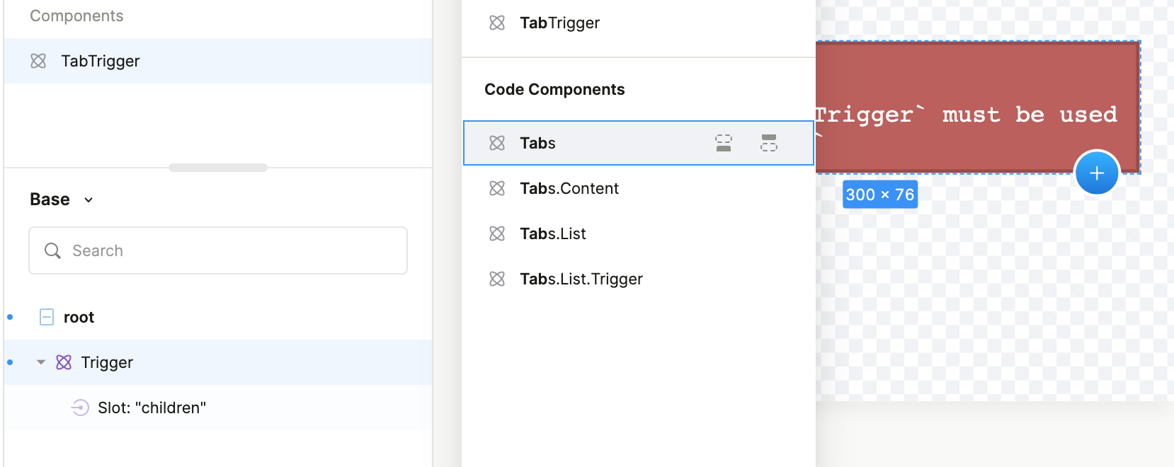
Yeah this is for code components. I want to allow our designers to create default component styles for this code component directly inside the Studio. However the package we’re using @radix-ui/react-tabs requires Tabs.Root to be present in order to use Tabs.Trigger. Meaning that designers won’t be able to create a component for Tabs.Trigger with just the styles because there would be a missing React context error.
If you’d like, I can hop on a call and go over the use case live, it might be easier
ah! I see. For now, an annoying workaround I can think of, is to do that “default” styling of Tabs.Trigger in your own css class, and for your Tabs component to always slap that css class onto any Tabs.Trigger it finds in its children.
We have been thinking about ways of styling components with many “parts” like this… Right now in Plasmic you can only style the root container of the code component. But we’d like to make it possible for you to expose multiple “class name” props in your code component, and to style each class name prop separately from within Plasmic. That would make it possible for your Tabs component to take in a class name prop for Tabs.Trigger, and put that class name onto the right place, for example.
@responsible_spider The context error is pretty common for me as well. If you get to resolve it please share your solution for it.
I was thinking of detecting the component vs page view as well because we can wrap the page in the context provider but individual components doesn’t know about the context and renders context error in ArtBoard.
@chungwu here’s some suggestions additional suggestions:
• Allow us to specify a “Wrapper” for components, it’s there visual/functionally just in the component view. Won’t be added when the component is added to a page/component
• Allow the ability to determine the current route. Example below (This would probably one of the quickest/biggest wins imo)
export const TabsTrigger = ({ children, className, value }: TabsTriggerProp) => {
  const { isEditor, isComponentView, route } = useContext(PlasmicCanvasHost);

  const childNode = (
    <RadixTabs.Trigger asChild value={value}>
      <div className={className}>{children}</div>
    </RadixTabs.Trigger>
  );

  // if (route === 'componentView') {
  //   return <RadixTabs.Root>{childNode}</RadixTabs.Root>;
  // }

  if (isComponentView) {
    return <RadixTabs.Root>{childNode}</RadixTabs.Root>;
  }

  return childNode;
};
@zonal_mammal currently the work around I have for this is just to treat code components for this as a wrapper and requiring the full use of the component and then dragging and drop in Plasmic components. Not the greatest or friendly to non-technical folks
1 Like
Still thinking through workarounds for handling active styles that are unique by components, dropped a suggestion in ideas that would quickly solve this use-case for me
I think in your case it’s possible to move the Root context along side it’s children becuase there is 1-1 relation over there.
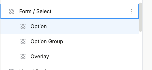
I have a FormContext that injects functionality into FormFields. Form fields can be of multiple types such as TextField, Select, Date etc.
Both FormContext and FormField are separate code components but they work together. I can’t use the FormFields in component because it will throw FormContext error. There are workarounds but it feels a bit hacky.
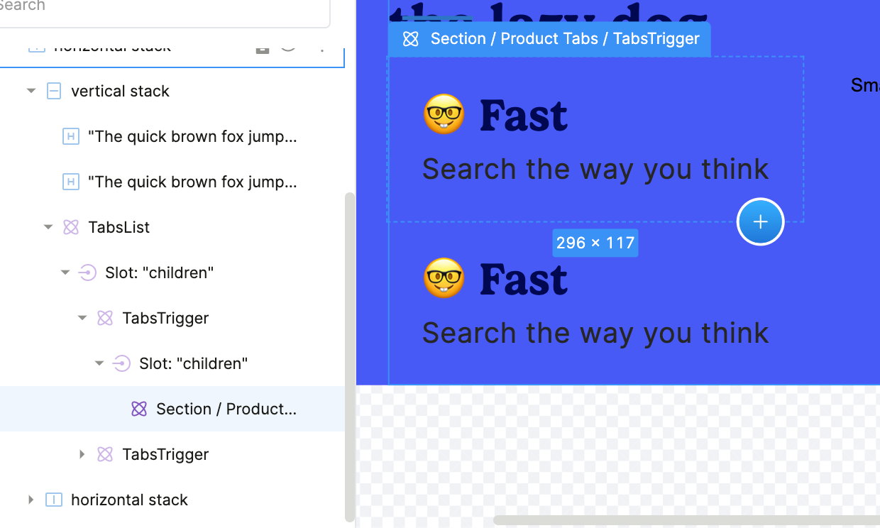
interesting… it’s not enough to just know you’re in component view or not (you could be using Tabs in some other non-page component too). But if we tell you the name of the component the artboard is rendering, then you can just specifically target when name is “MyTabTriggerWrapper”
@zonal_mammal I’ve ran into this issue early on using Formik and had to swap our marketing site over to use react-hook-form paired with substituteComponent to get around this error. (Def feels hacky tho tbh)
import { PlasmicComponent } from '@plasmicapp/loader-nextjs';
import { useController } from 'react-hook-form';

export const Input = ({ control, name: baseName, required, value: baseValue, ...restOfProps }: any) => {
  const {
    field: { onChange, onBlur, name, value, ref },
  } = useController({
    control,
    name: baseName,
    rules: { required: required },
    defaultValue: baseValue ?? '',
  });

  return (
    <PlasmicComponent
      component="Form / Input"
      forceOriginal
      componentProps={{
        ...restOfProps,
        onChange,
        onBlur,
        name,
        value,
        ref,
      }}
    />
  );
};
1 Like
@responsible_spider What I did is something a step further. Instead of substituting, you can simply destructure the children prop and render it by using
React.cloneElement(children, { …props })
Then register that input component and you can now pass children from the Studio. Users will be able to customize the styling of the children component because it’s directly coming from Studio.
P.S
I am using CodeGen. I don’t think that would make any difference.
That approach works as well, however the reason I didn’t opt-in to that was the fact that Children could be more than just an Input. Which would lead to a ton of unnecessary checks to see if it’s a valid form element or not
@chungwu is the canvas portion of Plasmic part of the repo? I’d be happy to contribute to the figuring out a solution for this since it’s blocking us from finishing our Plasmic migration

It’s not… Let me look into it!
@responsible_spider, Yeah that’s one thing to look for. For me, the rest of the elements that goes into children are code components as well so I can define them inside the allowedComponents prop provided.
@zonal_mammal definitely here where you’re coming from with this!