I was wondering, if I could change it so the ‘Tablet’ brakpoint isn’t shown anymore on the smartphone artboard
Right now you can’t, but I agree with you that it does not make much sense if you already have a tablet screen variant. I submitted this to the team to avoid confusion for the users
great
Thanks for the feedback
I think the reason it is there in the first place, is that I I created the smartphone artboard first
something else that is really weird: It seems I cannot change the tablet artboard without changing the smartphone variant as well (even though the variant is deactivated.
Here is a video showcasing this issue:
(by deactivated I mean not recording)
If you haven’t set a style in mobile and you edit the tablet version, it’ll be applied to both (the same way you would see mobile changes if you made desktop changes without setting an override in the smaller variant)
For the scale-factor input field you mentioned, a possible workaround would be to use plasmic tokens for sizing the elements you need to scale and later adding some script to change the token based on the screen width ( See here for token CSS variables )

unfortunately the fontsize of this element changes in all variants
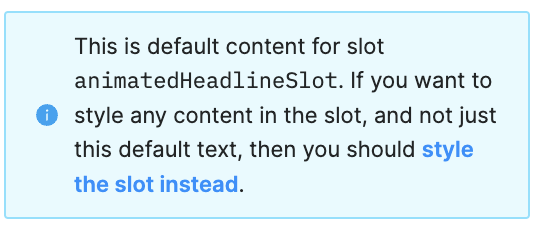
This looks like a bug. Can you click on the Slot and change the size from there?
OOh, I know what’s happening. It’s because of this warning here. You can get the result you want by following the steps on the video
the video shows me changing both content and target without the front getting smaller.
But that is because I was only changing one at a time instead of changing both. So it’s not a bug.
I just wasn’t paying enough attention at what is overriding what.
And I had to remove the styling from the slot content