I would like to make all of the content of a landing page scale - to make it look good on different screen sizes.
I have two breakpoints in Plasmic Studio(one for smartphones). And for each I want to set automatic scaling behaviour.
I’ve made a video to illustrate the problem (and a solution I have in mind):
https://www.awesomescreenshot.com/video/8619070?key=8c9f4ff9aba45aeb3aa6cdd4e6f24ccb
Maybe you have a different idea on how this could be achieved?
And while we’re talking about dynamic scaling:
I’ve addressed this before, but I think wanting elements(or the entire page) to scale based on screen-size is a common motivation, no?
I think it would be a cool feature to be able to set a factor(which can depend on screen-size) for the size of individual elements. I’m not talking about transform: scale (because that just changes the size of the content of an element without changing its bounds).
I’m talking about driving the font size (after telling the user to convert the values of a component to (r)em. Or doing it for them.) to scale stuff. Maybe this can be abstracted away in Plasmic Studio with a simple size-factor input field and also a checkbox that says “scale based on screen size  ”
”
I could still use some help here.
I want to figure out, why tablet screens are blank
Hey @still_peacock for some reason it looks like everything is set to Not Visible in the Table variant
could you explain to my why the smartphone screen has both the smartphone and the tablet breakpoint on top?
It has always been that way since I created this variant.
Because screen breakpoints are always cumulative. When you define a breakpoint, it matches everything with width <= “defined value”
for my landing page (since I’m scaling it) I don’t really need more than two variants where one is for smartphones and the other is for tablet and above
how could I remove the tablet breakpoint for the smartphone view?
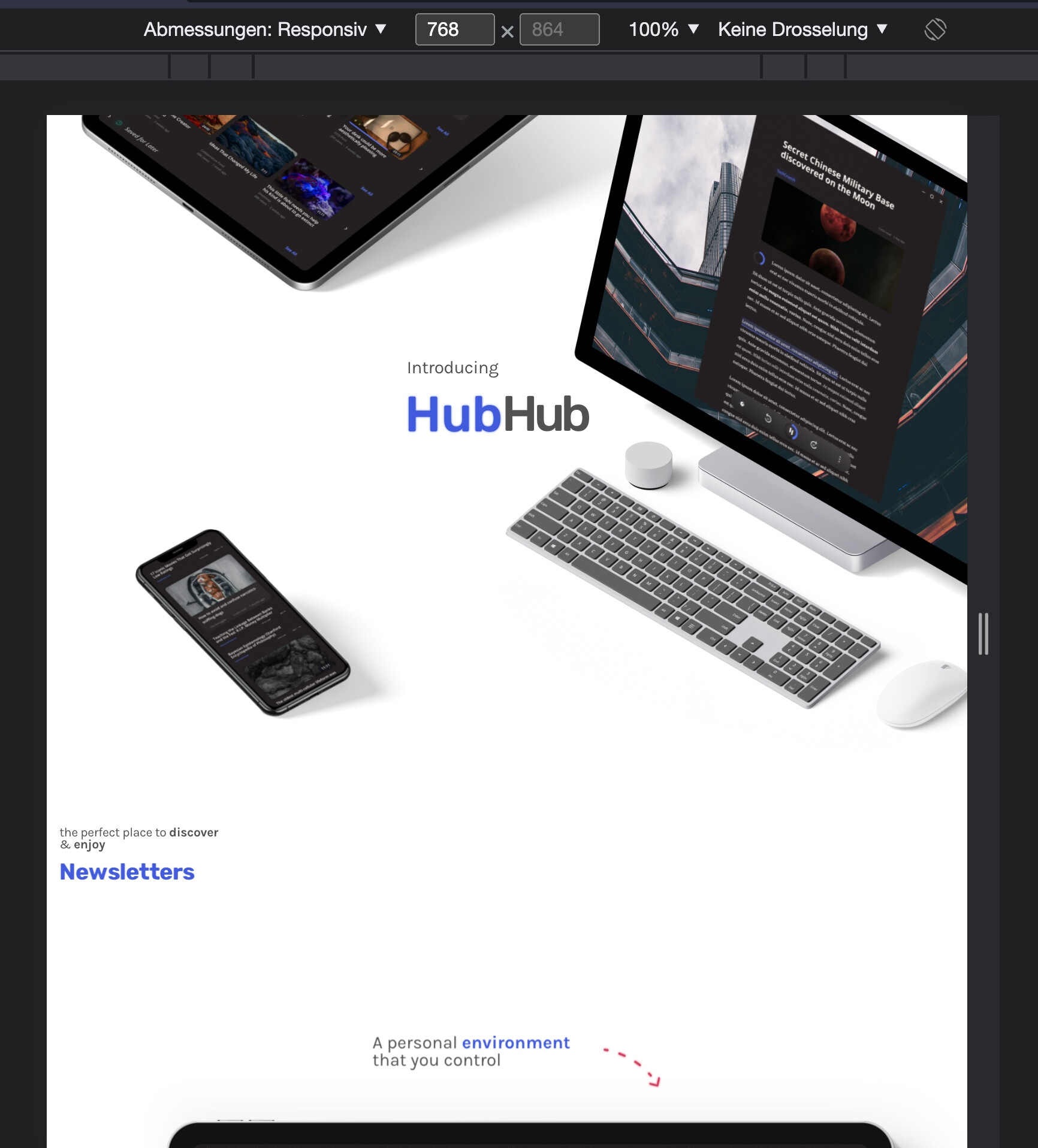
because right now for screenwidth 481-768 it looks a little different than it should. eg if you look at the hero section the text is misplaced:
now I could change that ofc by creating a tablet variant and modifying it.
but in theory I wouldnt need to.
does that make sense?
For screenwidth between 481-768 it’ll use the tablet variant from the tablet artboard… But I think it makes sense to hide the tablet variant from the mobile artboard since you already have a tablet artboard
Do you want the tablet to have the same styles as desktop?
but I think somewhere along the way it maybe wasn’t.
so some rules I set on the smartphone variant are now applied on 481-768