Great news! Plasmic component store just dropped, and the variants are all fully functional out of the box  I love it
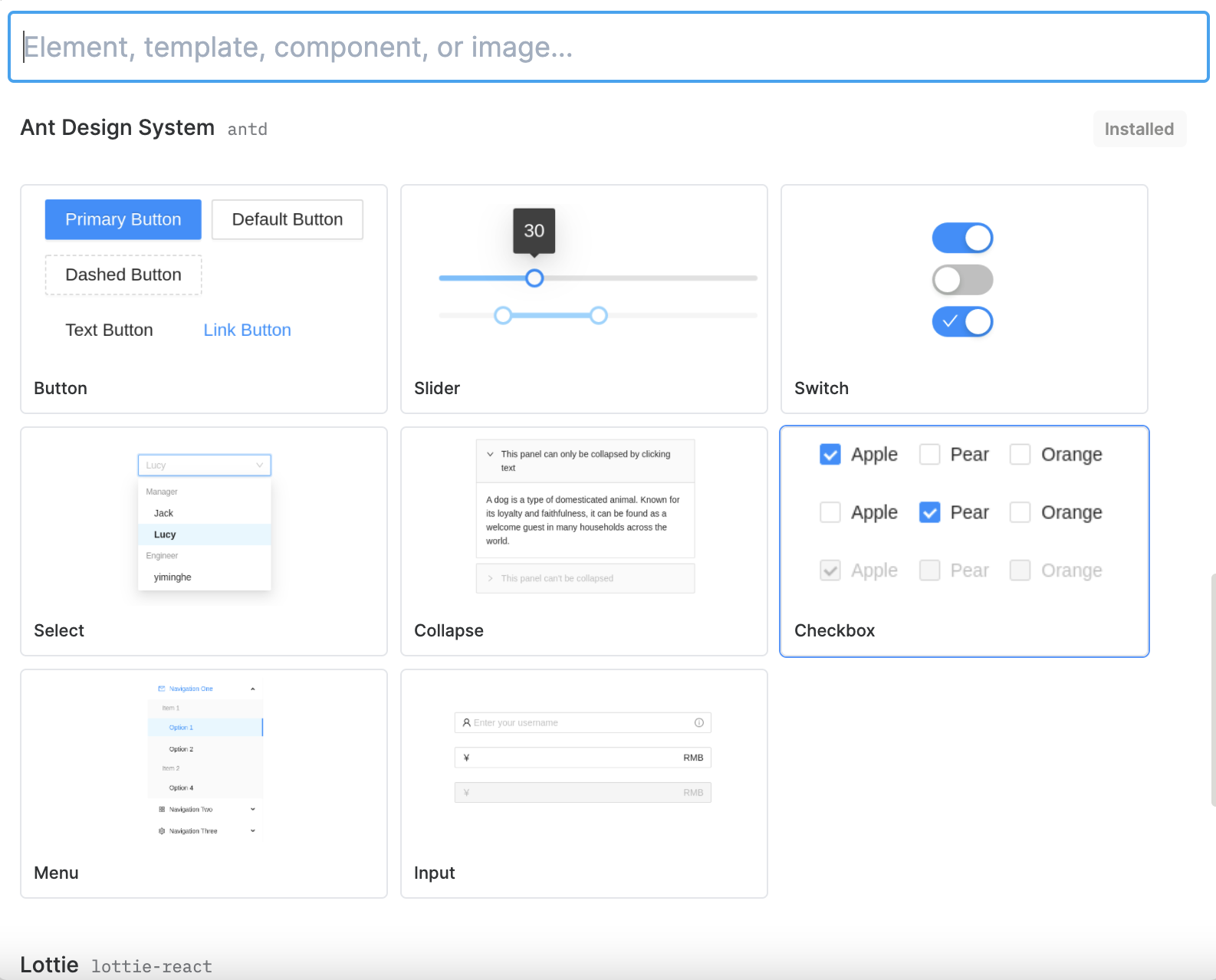
Everyone likes drag and drop components. But there are more custom components (datepicker, timepicker, datarange, calendar, form input field, toast, alert, rich text editor, table, drawer, carousel, popover, upload and UI components not from AntD) than the number of stars in the universe. Just let developers insert their own code in anywhere easily. Plasmic will become much better than Softr, Quarkly and other low code tools. I will pay for using it.
Hey @xeric_locust,
What exactly do you mean by inserting code anywhere?
Plasmic do support addition of custom code and helps you register your own omponents in Studio. Does it seems completely different from what you looking for?
Also other low code tools can do similar things.
We are all looking for some tools which can handle Html and CSS and give more freedom to insert JS part and show it in the studio. I hope there is a tool can just copy and paste demo code from UI frameworks if it is possible.
One thing is also important. No one wants one time generated code, which means once developers make some changes in the UI, we have to redo everything again.
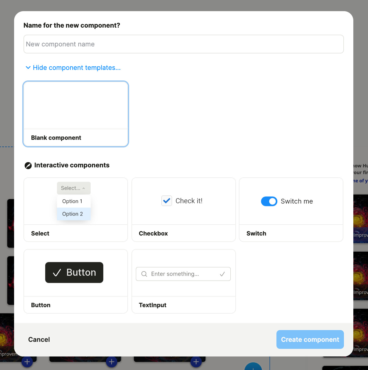
not seeing the component store on my end. guess I’ll have to wait until its my turn in the multivariant test 
Also, even after your screenshot Asim, it took me a while to find it.
And there are some usability lessons here for the team.
I’ve never used this big (+) button, because in the early days of using Plasmic, I decided it was useless.
“Why would there be another blue add-button(out of context)“? is what I vaguely remember thinking.
I’ve always added new stuff with my mouse using the add button inside the artboard I’m in.
Now, that my brain is not filtering the top left blue button out anymore, I’m actually glad that I have a search that can be activated with the Q button. I’m usually big on shortcuts.
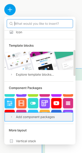
there’s a number of things you likely want:
• increase the # of users who see that there is a component store / interactive components (which might be combined with the former) / template sections
• make sure, that those three things have enough space to shine (not inside a small search utility)
• suggest search results from different categories (eg. in columns)
• reduce confusion about different + Buttons (two different + buttons in the left corner is not so sexy)
• train users to use their keyboard more often
• allow users to search actions(like an IDE)
I suggest leaving the small search utility where it belongs: in its local context(inside the artboard).
And removing the blue (+) button in the top left.
Instead I suggest adding a  -button in the Header and drill it’s shortcut inside the onboarding.
the (middle of the) Header will then transform in into a search input.
And before even the first typed letter, there should be a (almost) screen-spanning results-panel.
Showing frequently used stuff.
Showing the availability of a treasure trove of ready to use components.
It is also imperative(for any search bar imo), that the arrow-keys can be used to navigate results. Your search-bar for components allows you to access it with alt-P, which is kinda useless when you have to use the mouse to click on a component.
Honestly, you should get rid of the component list on the left sidebar if you go with my unified search suggestion. I have found the constant resizing of the splitter to the layers excruciating since the start!
And the new huge search panel can easily accommodate as an overview for pages, artboards and components. This component search/overview deserves it’s own shortcut.
But the regular search could also allow for switching between categories of searches. With the tab button for example.
Also keep in mind that arrow keys also work sideways.
And that a search-panel doesn’t necessarily have to close with the first press of the Enter key and can allow for steps.
@xeric_locust Ah I see. it’s much more intuitive that way. IMO, both has its own set of pros and cons. I don’t know how Plasmic team currently looks into it but Plasmic isn’t a complete IDE.
The similar stuff can simply be done by syncing the design and insert code anywhere locally in the IDE. We can make those components available for a designer to use them without having them to know details about the code.
For example,
For the same package, we can simply
- npm install it locally.
- import the component and register it with Plasmic Studio
- expose certain props as shown in quarkly video, that will be then available in Plasmic Studio.
IMO, this is much more flexible. I am not sure if quarkly support the following.
Having a complex component availabe at a single drag n drop.
Table Componet
Let’s assume we want to add a react-table npm package. It has a lot of different components/business logic that compose together to form a single functional Table component.
I don’t know if it’s supported in quarkly or how complex it can get there and whether the designer has to go through it once it’s done by the developers.
We can register this Table component in Plasmic where designers can use it without worrying about the details of the code and business logic. Developers can control the API for designers to interact with it.
I can’t tell you how excited I am for inputs and select options. Out of all those components it’s those little annoying, but essential, components that drive me crazy—Increment, decrement, steppers etc. Glad to see you have a set of cool building blocks ready to go!
@zonal_mammal Idk. I haven’t tried a complex component yet. But I think this is better than registering a component and then use it in the studio. Most of the time you just need to pass the props you need to config and most of them are default values.
@xeric_locust talking about passing props with default values - I’d like to bring meta props to your attention. Say you have a landingpage with a set of offer-components. And inside your code-base you want to know which of those is being addressed, for example to dynamically fill it with a number from your db of how many people have purchaced that particular offer. You can pass a mata-prop(eg. offer=1) from inside plasamic studio.
https://docs.plasmic.app/learn/updates/#attaching-metadata-using-component-meta-props
https://docs.plasmic.app/learn/code-component-substitution
Is it possible to create web stories using Plasmic? Is there a video component in the component store?
you mean a sequence of videos/pics like instagram stories? Could be done by creating multiple variants for however many parts(bars on top) are allowed. the video content could be substituted with your own component similar to the video in the second link.
 Thank you
Please add MUI into the component store!
mui est mui bien