I’m using the integrated (plume) select component.
It has its white design which doesn’t fit so well.
Was able to change the backround of the options panel by using the optionsContainer prop in PlasmicSelect. But I wasn’t able to change the text color of the options.
Hey @johannes_horteis, we recently launched a new Select customizable component, where it’s possible to change the background of the options. Would you like to give that a shot?
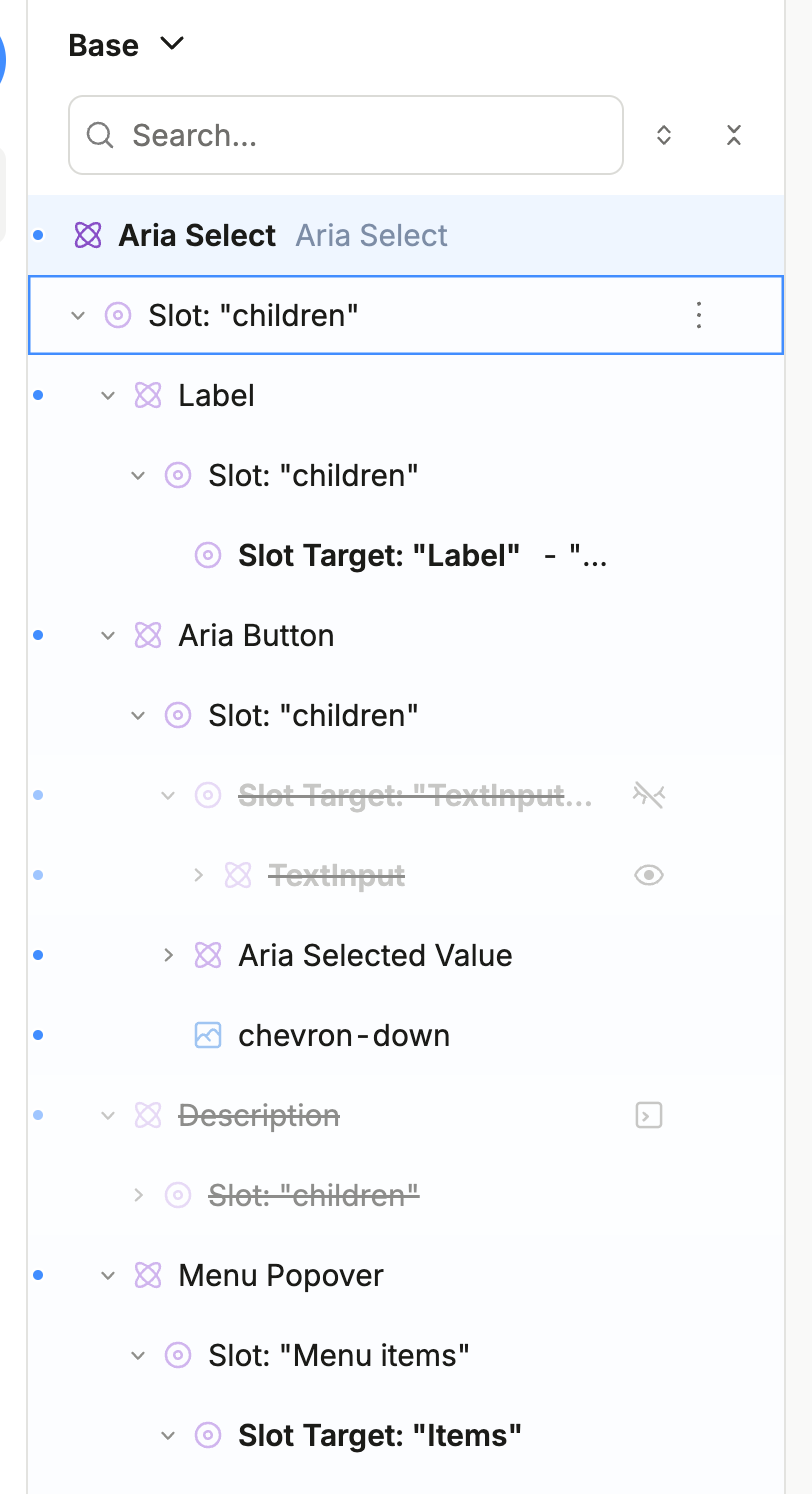
Note that in this Dropdown component, one of the Selects has so much code, because we display different options based on different conditions and we have a ‘custom option’ that turns the content of the aria button part into a texinput field.
Maybe you can answer me something about the component @jason.
Since I optionally have a text input field in there,
the feature where you type eg. 2 on your keyboard and then the first option that starts with a 2 is selected
is conflicting.
Right now I have a hacky way of solving this by making sure the option strings start with an empty space " 2" which is then removed after selection.
But maybe you have a less hacky solution for disabling this keyboard option selection behaviour?
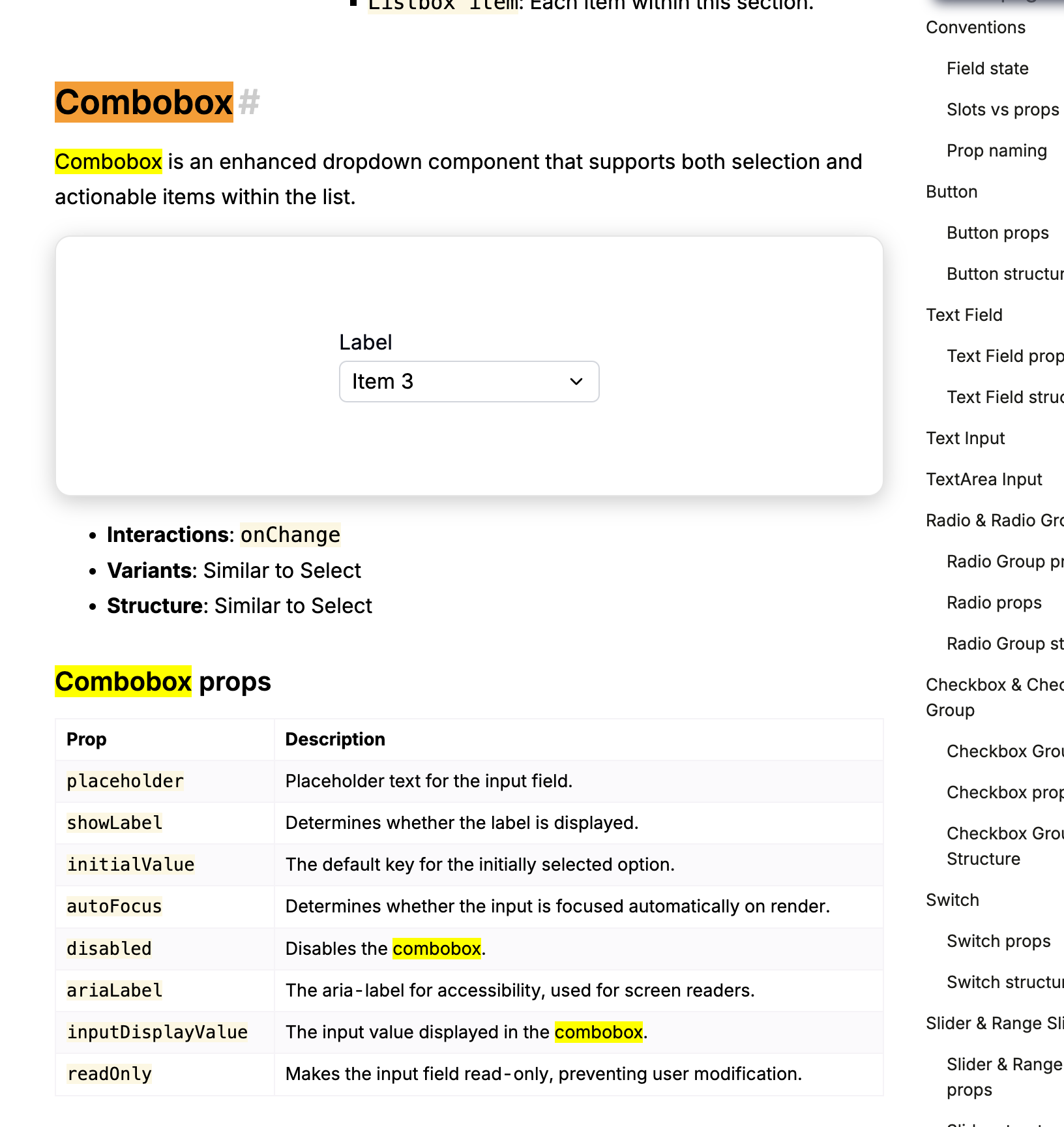
The new set of customizable components also includes a Combobox that is probably what you need here - it is just like Select, except that it has a text input instead of a button.